PAGE 58 – FEBRUARY 2007
H O T I D E A S F O R S M A L L R A I L R O A D S

This month’s Scrapbook has two parts. One part is Overhead Power — a second
batch of very small trolley/tram layouts, following up Scrapbook #54a. Have a look
below at Traction Action. The other part is an update to last month’s edition about
Hot Topics for 2007. If you’ll recall, the six Hot Topics listed there are:
- Motion Notions (animation)
- Sound Around (audio environments)
- Play On (operating systems)
- Material Matters (unusual modeling materials)
- Keen Scenes (interesting and different settings)
- Con-track-tions (space-saving track tricks)
I’m still actively looking for good ideas in all those areas, and grateful to everyone
who has sent me e-mails and photos and ideas for ways to apply these Topics to our
small layouts. This month, I ‘m adding a seventh Topic: Lighting the Layout.
We’ll call it…
![]() 7. LIGHT FANTASTIC
7. LIGHT FANTASTIC
All too often, a well planned, well-modeled layout is displayed by just placing it on a table and hooking up the powerpack. And the meticulous models and scenery are hard to see because the room light is too dim (or too bright) or is shining in the wrong places to show off the layout. I believe it’s worth the trouble to build your own lighting rig for a small layout — even if it’s only a desklamp placed in the right position. The right light can make our modeling efforts much more effective with the audience.
When I first exhibited Peek’s Pike at a clinic in Pittsburgh, I unpacked it from its box right in front of the crowd, carefully hooking up the backdrop and other scenery. Everyone watched intently as I placed a locomotive and some cars on the track. Then I switched on a carefully positioned Ott desk lamp — a daylight-corrected fluorescent light source. Suddenly all the colors and shapes in the layout snapped into brightness … and the audience actually gasped. For the first time, they saw the layout the way I had planned and built it. The lighting made a huge difference!
“Prof Klyzlr,” a pseudonymous modeler from Sydney, Australia, shares my interest in good layout lighting. He sent some examples of his work, writing: “Typically, we in Oz may have a nicely lit school library at one show and a horrible tiny ‘town hall ‘ venue the next. With such environmental variables to deal with, adding a roof to make a ‘clean slate’ and then adding your own deliberately configured lighting rig, makes all the difference and ensures a good presentation result, no matter what the venue.” For example…
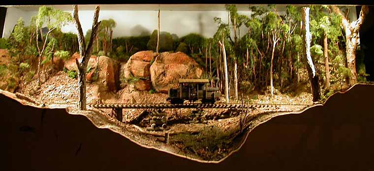
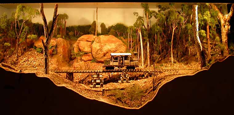
These two photos by Prof Klyzlr (above and below), taken on one of his layout modules, illustrate the need for consistent light levels across the layout. The top photo shows the view using only two lights, at the extreme left and right of the picture. Then, shot from exactly the same spot, the photo below shows what happens when a third light is introduced in the middle. Suddenly, the layout comes alive — and most important, the locomotive can be clearly seen and appreciated!
These two photos were taken under the halogen bulb lighting on the Prof’s 48x14in Nine Mile layout. The digital camera settings were not changed between shots, but the change in lighting even forced the camera’s auto white balance to re-adjust! The Prof comments, “12V AC halogens in gimble mounts have now become my favorite solution, especially as they are available at much cheaper cost… Here are two hints for using them.
“Hint 1: ‘Greaseproof’ baking paper is designed to handle over 500 degrees C, and can be easily glued over a halogen gimble to act as a diffuser.” [Carl: Diffusers can spread the light more evenly over the scene, eliminating “bright spots.”]
“Hint 2: The most common home 12V AC halogens are 50 watt, but are waaaaay too bright. 20W is fine for up to 3ft or even taller modules.” [Carl: I use 13-15 watt halogen desk lamps to illuminate many of my very small layouts.]
As a further illustration of his point, Prof K sent along two views (below) of his new layout under construction, Brooklyn: 3 AM. These two shots show the even lighting obtained from three 20 watt halogen gimble-mounted lights on a six-foot-long layout with a white, coved backdrop. You can see the lights’ positions glowing on the valence (which will be covered with opaque material when the layout is finished).
The Prof further commented, “On this layout I want to try modeling 3 a.m. [0300 hrs] on a rainy, drizzly morning. So there are some plans in hand to try using blue and white variable-brightness LEDs as low level light sources, combined with one or more ‘ultrasonic atomizer’ water vapour foggers. I think we may be able to get a usable ‘raining in the city’ effect.”
We hope to bring you the results of the Professor’s experiments in future issues. [The layout, by the way, is a version of Jack Trollope’s Pine Ridge II layout from this site.]
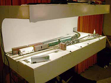
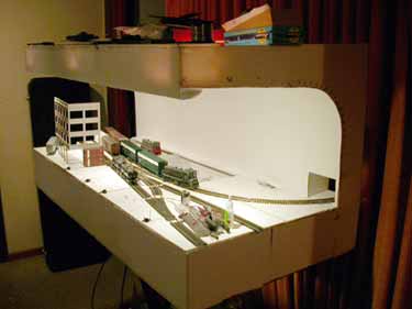
In England Paul Smith has also been experimenting with “night lighting” on his exhibition layout, Widnes Road. The layout is a finescale DCC 4mm terminus, with trains entering beneath the overbridge at the right, and ending at the buffers (bumpers) at the left end. The entire visible portion is only 4ft 6in long with a 3-road hidden traverser (transfer table) at the right end bringing the total length to about seven feet. The photos below give an idea of how the layout looks.
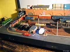
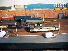
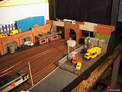
Then came “The Bet” — Paul wagered with some fellow Club members that he could turn this “five roads on a plank with two turnouts and a traverser” into a proper display layout by the Club’s Exhibition date, just a few weeks ahead. His wife suggested the winning strategy — build a night scene, so the scenery needn’t be very detailed!
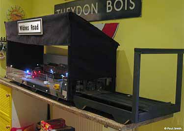
As Paul tells it, “My wife is an artist and visual arts teacher at a high school, and she designs and paints stage sets for the kids. She came up with the perfect solution, and my friend Dave and I spend a hurried Friday night before the exhibition constructing the wooden frame, whilst Alice got to work with the sewing machine! I have to confess I am now so pleased with the result (at right) that I am glad it ended up the way it did.
“At present, the layout is fitted with a light excluding ‘hood,’ which covers the whole operating section and has a small gap in the rear for operators to see through. At the front, viewers look through an open section, and both the outer ends are also screened. This cuts out about 80% of all room lights, rendering it dark enough for the layout lighting to provide the majority of the light by which to view it. The hood takes the form of a lightweight wooden frame, a bit like a traditional ‘Punch & Judy’ tent, and the fabric is attached in panels by Velcro. Currently for a day-time scene I simply un-Velcro the top panel! I am planning on fitting various lighting sources within the hood to enable a ‘moonlight’ scene to be created in the future.”
The photos below show some of the results of Paul’s experiments. More shots can be seen at his photo album online.
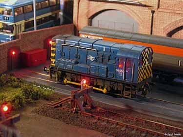
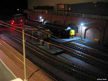
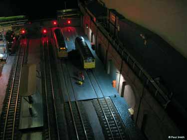
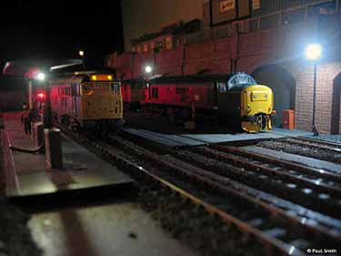
More comments from Paul: “I have been experimenting with different colour LEDs to try to get different lighting effects (see below). I am quite happy with the different light types — stark strip lighting for the arches and a warm glow from the office. Now about those van headlights, where’s my drill…”
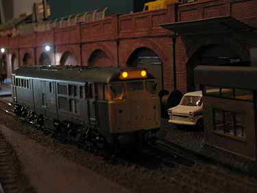
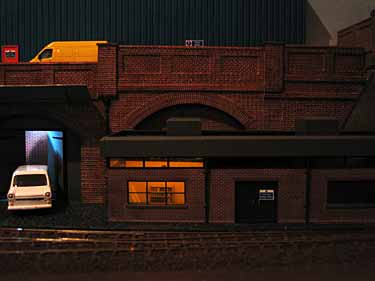
Widnes Road is mounted on a domestic shelf unit with six casters allowing it to be rolled about. Paul explains, “The layout fits in a Volvo station wagon in three pieces. Including putting the legs back on and plugging the power connector which feeds the traverser, I reckon it takes less than 10 minutes to get a train running! Two bolts, two screws, two power connectors (from a Radio controlled car), one plug. Job done.”
I think these two examples, from Professor Klyzlr and Paul Smith, show how effectively lighting can be used on a small layout, to make its impact more dramatic and to show off our models at their best. I’d like to hear your experiences with layout lighting and your ideas and photos about ways to use it. Just click the “contributions” button at the bottom of the page to get in touch!
And now for something completely different…

Trolleys, trams and interurbans — collectively known as “Traction” — are
naturally-born rolling stock for small layouts. Their curves have sharp radii,
a train can consist of just one car, and they run frequently and cover varying
routes. We showed a few small layouts designed for traction use in Scrapbook #54a,
and here are a few more to whet your appetite for this excitng branch of the hobby.
Layouts shown here cover all the major scales, from G to N.
G-SCALE TRACTION ON A BOOKSHELF!
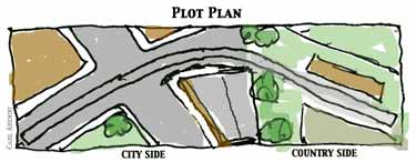
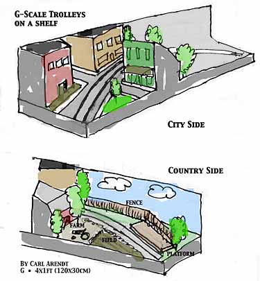 A friend of mine wanted a simple bookshelf layout to run his 4-wheeled G-scale Bachmann trolley. He suggested a variation on Bob Hughes’s space-saving design of Green End Quarry. I came up with this design, which replaces Bob’s backscene with a two-sided view-block building.
The line runs from city to country and back again. None of the city buildings is a complete structure, they’re all cut off by the boundaries of the layout — allowing us to have large G-scale buildings in a very small area. The country end can be landscaped as an end-of-the-line waiting shelter, the entrance to Electric Park, or whatever else you like.
N TROLLEY/TRAM LINE IN HALF A SQUARE FOOT!
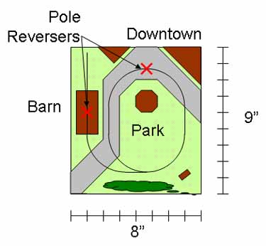 Nick Kibre, from California USA, designed this tiny N-scale oval trolley (tram) layout to fit inside a small end table. Measuring only 8x9in (20x23cm) overall, the line covers just half a square foot in area!
Nick is building two N-scale four-wheel trolleys to run on the layout. They both will have working trolley poles that can reverse direction automatically at the two positions shown (marked with an “X”), thus providing a form of point-to-point running as well as round-and-round.
For more details as well as information on some of Nick’s other N-scale traction projects, see his trolley blog.
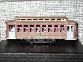
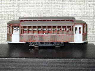
The two trolleys Nick is building are based on plastic car bodies from Bachmann (left) and Model Power. He’s converted both to one-man cars with one door on each side by blocking the rear doors on the original bodies. Paint and body putty will conceal the surgery.
FOR VARIETY, HERE’S A 1:32 TROLLEY/TRAM LINE
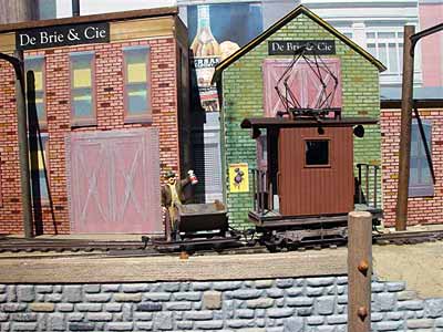
DeBrie et Cie. is a European style industrial tramway under construction by Richard Heisler, from Eureka, California USA. Track plan is a basic Inglenook and the scale is 1n20 (1:32 scale running on 16.5mm gauge). Richard scratchbuilt the little industrial lokey on a Bachmann On30 trolley mechanism. The layout measures 42x12in (105x30cm).
Scenery is almost entirely made from computer-printed paper, using textures from the Internet.
Richard was influenced by my Footers Dye Works layout, so DeBrie et Cie. is a dye maker, thus providing the Bachmann skips with bright colored loads to differentiate one from the other when solving Inglenook shunting problems.
UPDATE: AN O-SCALE LINE MAKES PROGRESS
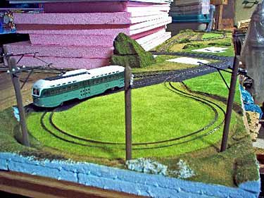
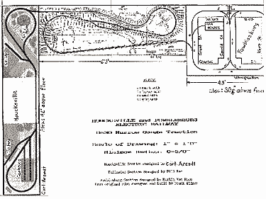
Martin Van Horn, of Towson, Maryland USA, sent an update on his Houksville and Fowblesburg traction empire, which consists of three small, interconnected On30 trolley lines (see plan above right). The line at the left side of the plan, a version of the Hidden Valley Traction layout from this site, was reported in Scrapbook #54a. Martin sent the updating picture at the upper left, which shows the first four trolley poles installed on the Electric Park loop of this line (not shown is the electric wiring underneath the baseboard, which connects everything together).
The line shown at the right of the plan is a square layout Martin built in the 1960s in HO, on a 30in (75cm) square table. It will be 45in (114cm) square in On30. For more info, see Martin’s web pages at On30Center.com.
AND IN HO, AN AMBITIOUS EUROPEAN TRAMWAY
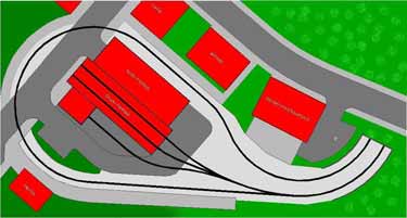
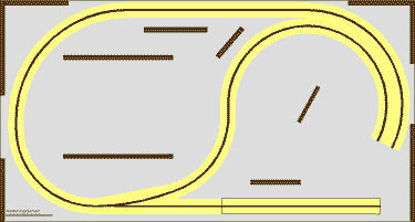
UPPER LEVEL LOWER LEVEL
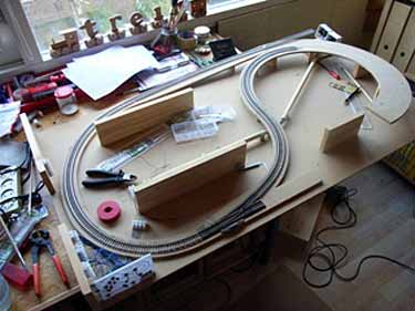
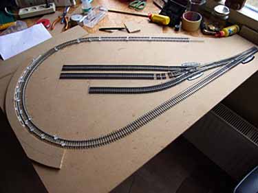
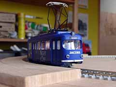
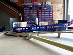
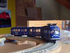
Marc de Bruin, from Barendrecht in The Netherlands, is building this compact transit line in HO scale on a 70x131cm (28x52in) baseboard. The two-level design provides a hidden source of continuous traffic on the lower level (including a cassette siding for adding trains to the mix) and a passenger destination platform at the upper level, along with a planned car barn (two-track car shed). The scene represents a tram terminus somewhere in Germany. Marc has just begun building this little line, inspired by this site. The photos below show the current state of the layout. You can watch progress at his website.
Leave a Reply