PAGE 57a – JANUARY 2007

I need your help! I have a short list of topics that I think are very important
for making small layouts more exciting. I’d like to showcase them this year.
But to do that, I need your ideas, photos and information about how you
use or might use these elements of modeling. So here’s my wish list.
Please be in touch! (Click on “contributions” at the bottom of the page.)
![]() 1. MOTION NOTIONS
1. MOTION NOTIONS
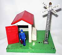 One sure fire way to increase the “fun content” of a small or micro layout is to add animation to the scene. Anything that moves — from a fisherman’s rod rising and falling to the revolving blades of a windmill — helps to bring the scene alive and make it more appealing to the operator as well as to the audience. This is not a new idea …the little guy at the right (c. 1947) is the most popular model railroad accessory ever built. He’s Lionel’s “Crossing Gateman” who pops out of his shack whenever a train approaches and waves his lantern to discourage auto traffic from charging into an oncoming million-pound locomotive. Many thousands, perhaps even millions of copies of this accessory have been used on Lionel and American Flyer layouts.
I think that simple animations can add a large amount of “play value” to any layout. And I would challenge you to think up some new and different ones to add unexpected pleasures to your pike. Here are a couple examples of what I mean.
One useful animation where ideas abound is in Unloaders or Tippers … where open cars can visibly be relieved of their cargoes before your eyes. Creative ideas are needed in all scales on how to accomplish this “dumping” action! Bob Hughes, from Sandbach, Cheshire U.K., used a simple but effective technique in his G-scale micro layout, Green End Quarry (featured in Scrapbook #41). Loaded V-tip cars come to the mill (below, left) after being loaded at the quarry (directly behind the backdrop). The mill’s tipping site is somewhat concealed by shrubbery, so that Bob can reach from behind the building with a hooked rod (below, right), catch the lip of the tip, and dump the car’s contents into a chute that lets it fall behind the scenes (where it can be returned to the quarry tippler for reloading the cars).
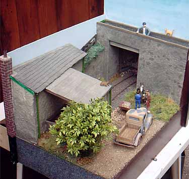
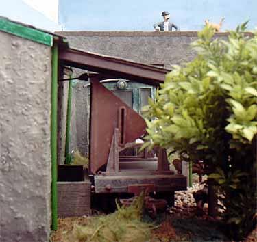
For more on Bob’s methods, see his website. There are lots of other ways to tip and unload an open car, and I’d like to hear from you if you’ve built one! Also, don’t forget about the other half of the activity … loading the cars at the mine, quarry, or whatever. I’d like to see your innovative ideas for loading cars as well!
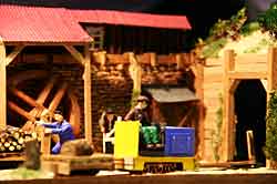
Another example of animation is a new shoebox layout, Rittigsmühle (Rittig’s Mill). being built by Alex Lehmann, in Mannheim, Germany. Unveiled in last month’s Scrapbook #56a, Rittigsmühle centers around a mill which will be powered by an overshot water wheel. A narrow gauge railway brings supplies to the mill and hauls away the finished product. Alex has just completed work on the wheel (below, left), which rotates at a convincingly slow rate (about 8 rpm). The motor is concealed in an “auxiliary outbuilding” at the right. The surprisingly simple drive mechanism is shown in the back view (below, right). A rubber band transmits the rotation to the wheel, with power supplied by a 4.5V battery. Alex will be adding the water raceway and other scenic details to this tiny Oe scale pike (O scale on 9mm gauge) measuring just 315x158mm (12.4×6.2in).

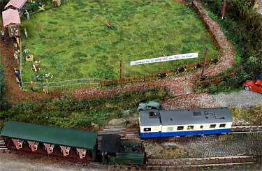
And finally, two examples of highly imaginative layout animation scenes, from two master modelers in the Netherlands. Jan Van Mourik is currently exhibiting Uivernest, an HOe layout (HO scale on 9mm gauge) that centers around a model airplane flying field (below, left)! The animation includes a man in red in the center of the field, who holds the tether to the yellow model biplane (just visible at the upper left of the photo). The man revolves 360° and the plane appears to fly in a giant circle around him. The narrow gauge trains haul the crowds to the field, so the animation is not only interesting in itself, but is integral to the purpose of the layout. We’ll be showing more of this delightful project in the near future.

![]() 2. SOUND AROUND
2. SOUND AROUND
Another way to greatly increase the enjoyment of a small layout by both the operator and the audience is to add an audio environment to the display. A sound surround, if you will. This is not the train sounds — they travel with the train these days, thanks to DCC and the like. But a permanent speaker installation built into a scene can use sound to immerse the viewer in the layout and give an astounding sense of reality that is enhanced when the trains run through. To give you a feeling for what I mean, I’ve asked Jim Wells, of Fantasonics, for permission to use a small sliver of one of his excellent 60-80 minute sound tracks.
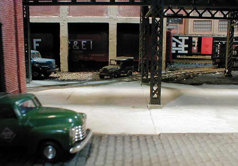
The photo below was taken by Charles Hansen, of Boston USA, on his HO big-city switching module. We’ll see more of this well-executed road in a future issue, but for now I’ve borrowed Charles’s photo to use as a demo of what a sound environment can add to a layout scene. So sit back, look at the photo, click on the sound (in stereo if at all possible), adjust the volume to a gentle, soft background level, and let yourself drift into the scene.
You should see a sound control panel right above this line. To hear the sound environment, click on the arrowhead. If you can’t see the controls or hear the sound, you probably don’t have an MP3 audio plug-in for your browser. I’d recommend Apple’s QuickTime, available free for any computing platform here.
This is just a small example of the effects you can get from using ambient sound on your small layout. For another example, see John Peckham’s Rockport Maine layout in last month’s Scrapbook. John uses a four-speaker setup to create the layout’s audio environment with ocean and country sounds.
If you’re working with sound, I’d like to hear from you! If you’re interested in exploring the subject, a good starting place is the Fantasonics site mentioned above. The clip played here is taken from “Big City – Modern,” one of a bunch of available environments, all sampled at the Fantasonics Audition page. I think there’s a lot we can do with sound to increase the “fun” of our layouts! What are you doing?
![]() 3. PLAY ON
3. PLAY ON
No question about it, one of the biggest challenges — and biggest satisfactions — of small layouts is their operating potential. We want to design in as much “play value” (operating capability and flexibility) as we can, in a very small area. And then, we need an operating system to take advantage of all that potential!
Operating systems come in many flavors and styles. I’d like to explore as many as we can in 2007, adapting them to the needs of small layouts. We’ve covered a number of operating sytems at various places in this site. And I’d like to hear about how you run your layout!
To get the conversation started, here are two layouts with unique operating systems — one in the U.K. and one in the U.S.
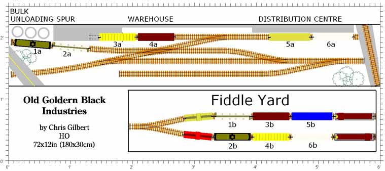
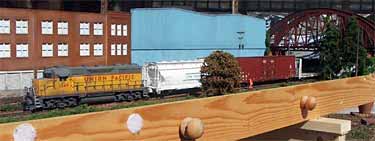 Chris Gilbert, who lives in the West Midlands of England, chose U.S. prototype trains for his latest exhibition layout, an HO switching shelf of 1x6ft plus fiddle yard. Chris uses DCC control and Tortoise slow-motion point motors (switch machines). And he has an operating system. Chris explains:
“I’ve now devised a simple operation for shows. It uses 2 locomotives and 12 cars, two for each spot on the layout.
“I have six cars in their respective spots on the layout; 1a, 2a, 3a, 4a, 5a, and 6a. The fiddle yard holds two trains, each one with 3 cars and a caboose. Train One has odd-numbered spot cars 1, 3 and 5. Train Two consists of the even spot cars, 2, 4, and 6. The first three car train is pushed on with cars of all the odd spots; 1b, 3b, and 5b. Its job is easy enough, just to swap the cars — but it involves moving nearly every car on the layout to do this.
“It can take up to 45 minutes to switch out the cars and make up the return train. The train then heads back to the fiddle yard. The next day’s train with the even spot cars 2b, 4b, 6b and caboose is pushed on with the other loco. Again it takes about three quarters of an hour to do the switching. The cycle then repeats again, but it can take up to three hours before the cars are back where they started.” For full photographic coverage of an operating session, see Chris’s website.
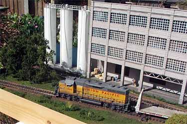
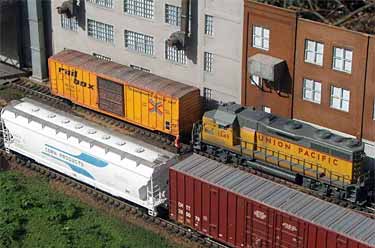

Now, follow along on this car-spotting diagram, as Bob explains how he operates this complex trackage!

“On this diagram,” Bob begins, “each letter represents a location or ‘industry’ on the layout where cars are spotted.
“Original operations. There are 22 locations marked A1 thru G3. The yard will hold 4 cars. Cars on the layout are always at a specific location. Cars in the yard are never in any specific order.
“At the start, there are 12 cars on the layout and 4 in the yard. The object is to pick up 4 cars and set out the 4 cars from the yard. In the beginning, I used a simple card system to randomly pick cars and locations.
“The runaround was designed to hold three 40ft cars, and each end of the main line holds three 40ft cars and a switcher. In reality, one of the cars can be 50ft long. I use a variety of cars and switchers so depending on the rolling stock in use, you may or may not be able to fit that many cars in any one location. This adds to the complexity.
“Revised Operations. Track C became part of the yard. The total number of cars in the yard is now 6. There is no set order to the cars in the yard. I now pick up 6 cars and set out 6. This process generally takes 30 to 40 minutes.”
There’s more about Bob’s operating system at this discussion forum.
Both the above systems use assigned spotting points for specific cars, and the operator’s challenge is to perform the indicated tasks in the shortest period of time. Obviously, this method is extremely well suited to shelf switching layouts! On the other hand, there are lots of alternatives. What system have you developed for your small layout?
![]() 4. MATERIAL MATTERS
4. MATERIAL MATTERS
 One development in recent model railroading has been the use of a wide variety of new modeling materials. Many of them save time in modeling, and many of them save weight — very useful for small, portable layouts.
For example, the use of extruded polystyrene boards (pink or blue insulating foam) for baseboards has made possible small layouts that weigh virtually nothing but have nicely sculptured landscapes rather than “flat tops.” And using foamcore board for baseboard construction can save on weight, time and even cost! You just glue it together with a hot-glue gun — I’ve built very sturdy 1×6 shelves for switching layouts from foamcore board in less than half an hour!
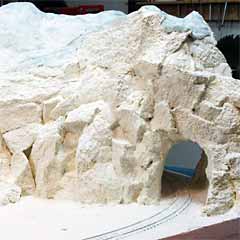
Another revolutionary materials idea shown at the left is called FRocks — making rockwork out of foam rubber coated with plaster. The weight saving over traditional plaster rockwork is phenomenal. For more information about FRocks, see Australian Mario Rapinett’s primer page on how to make them. The FRockwork shown is under construction by Michael Mott, who lives in Alberta, Canada (Michael’s web site is here.)
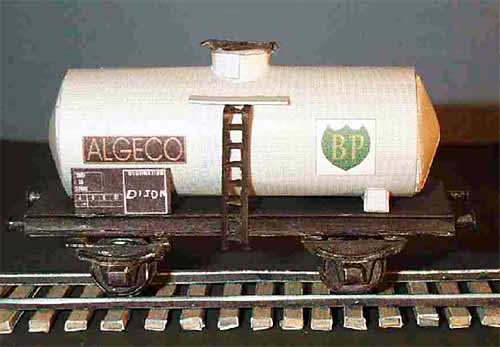 Another unconventional material that is making a comeback from the early days of model railroading is Paper. Back when there were very few kits and even fewer parts made commercially, most house car sides and many other modeling items were made from paper or cardboard.
These days, the use of paper for modeling is spreading from rolling stock to buildings to backdrops, and many other new uses for it. Last month, for example, we showed in Scrapbook #56a a small Japanese pizza layout made entirely of paper, from the rolling stock, to the landscape and base, to the gear train driving the motion!
And pictured here is an amazing paper tank car model, designed and built by Bernard Caer, of AmigaTrainz. If you’d like to try your hand at building a scale model entirely of paper, Bernard has posted his “Wagon Citerne” pattern as a PDF file here. By the way, even the wheels and axles of this operating model are made from paper (actually, thin card)!
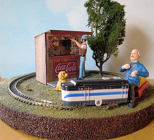 As a simpler example, here’s a photo of a little Gnine pizza layout (that’s G scale running on 9mm gauge, representing a 9.25in gauge miniature railroad). I originally threw this together as a setup for testing closeup photos from a new camera. The train is an XTS Train Set toy, battery-driven and running on N gauge track (see #45a and #51).
In order to fill in the center, I designed a little lunch/news stand on my computer. When I posted the picture, a number of people decided to build the lunch stand, probably because it’s quick and easy. If you’d like to give it a try, you can download a PDF file of the pattern here. Just print it out on a letter-sized sheet of paper (US or A4), cut it out, and glue the pieces together. There are no other instructions because the assembly is obvious. I use yellow carpenter’s glue, because it’s high tack, sticks things together quickly and holds without slippage.
(If you can’t open a PDF file, you can download the free Adobe Acrobat Reader for your computer here.) The lunch-stand file is in 1/24 G scale. If you’re working in U.S. O scale (1/48), print it at 50%. For HO scale (1/87), print at 27.6%. For British OO scale (1/76) print at 31.6%. For N scale (1/160), print it at 15%.
Now …. what applications of unusual materials can you recommend to help small-layout modelers?
![]() 5. KEEN SCENES
5. KEEN SCENES
Another way of sparking interest and providing lasting enjoyment of your small layout is to select an unusual location for its setting. Something different in the way of scenery can liven up even an ordinary track plan. We’ve already encountered on this page several unusual layout settings — for example, under “Motion Notions,” the two Dutch layouts are set respectively at a model-airplane flying field and a WW1 British military post – not your usual scenes for a model railway – and both gain much extra interest thereby. So rather than settle for a “simple GWR station.” or a “switching road serving various Walthers industries,” it might be worth taking some thought about a different locale, to add spice to your project.
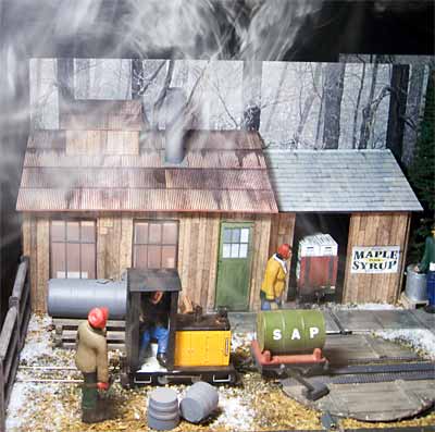 For instance, this Gn15 layout is my Somerset Agricultural Products or SAP Line. It represents a maple sugar house in rural Somerset County, Pennsylvania, one of the state’s most active maple-syrup producing areas. It happens to be less than an hour from my home, so research was easy. The 20x14in track plan and another photo were shown in Scrapbook #52a.
The narrow-gauge railroad was installed by a railfan farmer to bring maple sap from the forest grove (sugar bush) to the sugar house where it’s boiled down into syrup. And of course, a prototype sugar house in operation is always surrounded by a wreath of white steam, which gave me a chance to add some extra life to the model. A smoke generator in the chimney produces a steady stream of white smoke during operations.
And all those factors make possible a final touch. As the smoke (steam) fills the scene, the audience suddenly realizes that they’re smelling the mouth watering aroma of maple sugar–just as they would if they were standing in the real sugar house!
I call it the Arendt Aromarama. Right, you’ve guessed the secret — the steam is scented with maple sugar smells, available from Mega-Steam. All this is made possible by selecting a distinctive and unusual location for the pike!
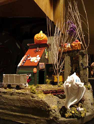
| Sometimes simply changing the locale — without changing the track plan or operating pattern — can add a whole new dimension to a layout. This startling example was built last Halloween by Mark Holmstrup, from Albuquerque, New Mexico USA, and his two children (aged 5 and 10). It occupies one square foot (30x30cm) and follows exactly the track plan and operating scheme of my Squarefoot Estate Railway. But when it comes to scenery — what a difference!! The railway is bedecked with seasonal decorations. Its mission is to load Halloween candy (M&Ms) inside the factory and discharge it into a candy dish at the front of the layout, for Trick-or-Treaters to enjoy! Right now the road is operated as an On30 line, but Mark and the family are getting ready to convert it to Gn15 by exchanging the loco cab for a larger version. That, and finishing up the “candy wagon” are on the agenda getting ready for next year. No one can describe the Holmstrups’ layout as ordinary! | 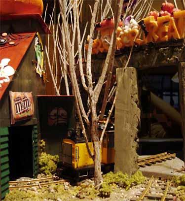 |
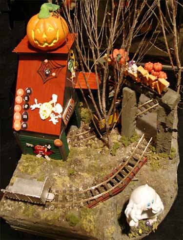

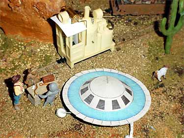
Russ Haigh, from Willoughby, Ohio USA, decided to take “a little look at how things would have gone around Roswell, New Mexico, in 1947 if we let them go about their business.” His 18x12in (45x39cm) On18 (O scale on 9mm gauge) layout shows the aliens working on repairing their grounded saucer. They’ve built a small narrow-gauge railway (adding their own energy systems to some human-built locomotives) to bring minerals in from the hills for processing. Track formation is The Fork, familiar to readers of these pages.
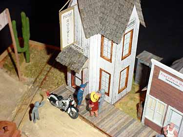
Russ also shows the aliens going “about their business” of selling high-tech mementos to visiting scientists and engineers (lower left photo) and helping the tourists to enjoy their visit to sunny Roswell (below, right). This layout, with its highly unusual theme and scenery, won the Ohio Narrow Gauge Mini-Bunch’s 2006 Whimsical Model Contest.
![]() 6. CON-TRACK-TIONS
6. CON-TRACK-TIONS
The final Hot Topic for 2007 is a familiar one — how to squeeze a maximum of useful trackage into a very small space. A large number of suggestions, tricks, and workarounds add sparkle to this Web site, but I keep encountering new ones all the time. I’d like to see your space-saving track arrangements!
| Here’s a good example of a space-saver! One of the delightful layouts designed by Jack Trollope, who lives in the Highlands of Scotland, is Jaxcilli Industries. It’s a knot of tracks on a grade, arranged so the top end is directly over the bottom end, and the upper hopper car can be emptied into the lower one. Then the operator switches the positions of the two cars, and does it again.The photo at right shows Brian Greiner’s version of Jack’s original design, using 36ft hoppers to save space at the tipper. But a new version of this ingenious perpetual-motion layout has just crossed my desk… | 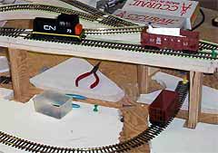 |
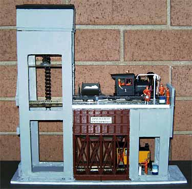 It’s called Jaxcilliest Enterprises, and it’s the work of John Garaty, from “Unanderra in Oz” (Australia). John has faithfully reproduced the operation of Jaxcilli Industries, in a total space of just 12×3.75in (30×9.5cm) — just about the size of a half sheet of letter paper (either U.S. or A4). And the scale is On30 (O scale on 16.5mm gauge)!
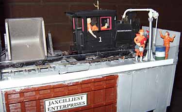
Further, the two wagons have been replaced by a single Bachmann 0n30 V-tip wagon and an operating bin (animation!). John explains, “Basic construction is foamcore hotglued around a Lifelike HO Coal Loader accessory bin. The bin was internally baffled to restrict the loading aperture and minimise spillage. Maximum travel on both decks is about 4in (10cm).
“Motive Power is the On30 0-4-0 Bachmann Porter on the upper deck and the Davenport gas-mechanical loco on the
lower deck. The locos are not interchangeable as the steam loco is slightly taller and fouls the bottom of the bin when used on the lower deck.”
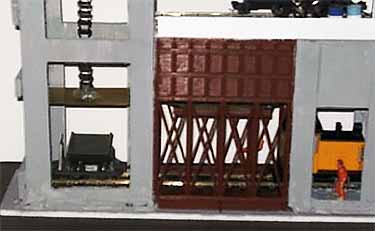
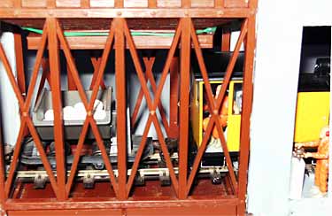
“The wagon lift [elevator] was designed to lift a Bachmann V-tip wagon. It uses a Tamiya universal gearbox with approximately 700:1 reduction. The gearbox comes complete with a small 3V DC electric motor. One end of a Tamiya sprocket and link chain set is attached by hot glue to a brass cage that is large enough to hold the wagon.
Operation of the layout is described in the sequence of photos below. At the top left, the V-tip wagon has just been emptied into the bin. Notice that in honour of the occasion, John has provided a Piper in full regalia (and his bagpipes) to pipe the first load aboard. It’s a recognition of the pioneering work of Highlander Trollope! At the right, the empty wagon has been placed on the lift and lowered to the bottom.
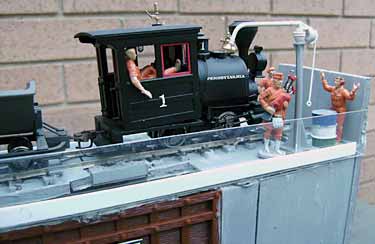
Compressing track patterns into a smaller space can also result from using the tricks we’ve suggested so often in these pages. Here’s an excellent example of how a good, workable small layout can be made even smaller if your space is severely limited.
Casey Sterbenz, from Crofton, Maryland USA, converted another Jack Trollope design, St. John’s Yard (from last month’s Scrapbook, #56a) from the original 38x14in HO design to a more conventional O-scale two-rail layout featuring 50ft U.S. cars and a powerful Weaver RS-3 locomotive. Casey points out, correctly, that this basic design translates comfortably into a respectably small O-scale layout at 12x3ft (3.6×0.9m). Casey declares that besides using American 50ft cars and large locomotives, he “also substituted a turnout for the sector plate. My RS-3 is about 15in long and a 50ft box car is 12 1/2in long, making a coupled-together length of about 28in. That would be the minimum allowable length for a tail track (head shunt). The drawing shows Atlas #5 turnouts which are 20″ long. I threw the drawing together using the free Atlas RTS 7.0 software. ”

.

The dimensions now have shrunk to just 10×2.4ft! After I suggested this course to Casey, he got into the same groove and replied, “I carefully measured some of my equipment last night. My GE 25-ton switcher and two 40-foot cars will fit in the same space as my RS-3 and one 50ft car. So, a 28in sector plate and tail tracks will do admirably for this combination. Using the 25 ton switcher and just one 40in car, you shrink that by 11in, making the sector plate only 17in long.” So if you use the shorter switch engine and standardize on 40ft cars (instead of the more-modern 50-footers), the layout dimensions become 8.2×2.1ft (2.5×0.6m)!
And Casey had still more ideas about compression: “You can play more games with the track. 1/48 scale standard gauge turnouts are available from Old Pullman Models . These are viable alternatives to the Atlas components I originally used in the drawing. While it would be a bit more work than using the “snap track” components, you can save some more length because an Old Pullman #5 turnout comes in at 14-1/4in compared to the 20n length of the Atlas component. Old Pullman #4 turnouts (a size not available from Atlas) are only 13-1/4in long. You could also develop the track plan for 0n30 use, which would reduce the length of the layout somewhat more.”
And I’ll bet if he thought about it longer, Casey could come up with still more techniques for Con-Track-Tion!
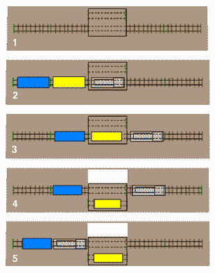
 And then there’s the whole area of switching puzzles and saving space in shelf layouts. For instance, most layouts need to have a runaround track, in order for the locomotive to get on the other side of a car to switch it into a facing siding. Consider the puzzle at the right: there’s only room for one 40ft car or one SW7 loco at each end of the runaround track. The puzzle is to exchange the places of the two cars, so instead of being BLUE-YELLOW they are YELLOW-BLUE. This is a pretty easy puzzle, and the minimum layout for it in HO scale is about 41x6in. (using the short Peco Setrack turnouts).
Alex Lehmann, from Mannheim Germany, pointed out that the same puzzle could be set up using a small two-track transfer table (traverser) that was just one car-length long and fed tracks at each side that were two car-lengths long. The whole layout, as shown in Figure 1 below, would measure about 30x6in (180 square inches, compared to the runaround layout’s 246 square inches). Is Figure 1 really an equivalent puzzle? Follow Figures 2 to 10 to see the answer!
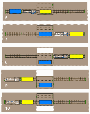
All three of these space saving ideas are pretty familiar to readers of this Web site. But there are many more tricks with track that save space and are not so obvious. How about sharing yours?
So there you have it—six areas that I think can add immeasurably to the fun of a small or micro layouts. To recap:
- Motion Notions (Animations)
- Sound Around (Audio Environments)
- Play On (Operating Systems)
- Material Matters (New and unusual modeling materials)
- Keen Scenes (Interesting and different settings)
- Con-track-tions (Space saving track tricks)
I plan to highlight these areas during 2007, and would like to hear about your layouts, modeling experiences, designs and ideas for making small layouts more fun in these ways! Just click on “contributions” below. (Of course, we’ll also continue to feature new small layouts and pike plans—keep ’em coming!).
The attractive “Clay Pots” icons used in this article were designed by the talented graphic artists at IconIcon.
Leave a Reply