PAGE 55a – NOVEMBER 2006
H O T I D E A S F O R S M A L L R A I L R O A D S

The best test of an “inspiring” layout is whether seeing it gives us some great
ideas to try out in our own projects. Here are a group of layouts that, in different
ways, have given me such inspirations. I hope you find them infectious too!
VISIT A MASSIVE INDUSTRIAL COMPLEX
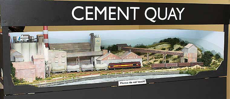
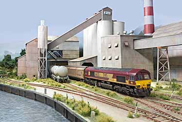
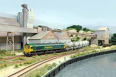
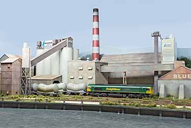
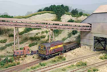
One of the things that always gives me inspiration is complex industrial structures, with their varieties of shapes and sizes, masses and textures. Chris Nevard’s new layout, Cement Quay, carries on his tradition of producing carefully crafted “big industries.” Notice how, in just 66x24in (168x60cm) he’s managed to suggest a huge cement plant complex served by large freight locomotives. Operational devices (see plan below) include 42in (107cm) cassettes attached to the two fiddle tracks that exit the scene at left; and the use of two locomotives to handle longer trains despite the short runaround loop.But the centerpiece is the concrete plant itself. This layout is an enlargement of Chris’s wonderful Arne Wharf, described in Scrapbook #25. I particularly like his conveyor structures that provide diagonal lines to contrast with the perpendiculars in the main buildings. And of course, the round storage tanks and smokestack (chimney) are excellent for breaking up that “square” look. Chris lives “on the edge of SW London.”

THIS UNIQUE LAYOUT IDEA IS AN ‘OPEN BOOK’
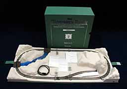 | Tenshodo, in Japan, used to offer this portable N scale folding layout commercially. It’s a triple fold, fits into a dust sleeve and slides easily into a bookcase. Rolling stock is shorty “B Trains” on 100mm (4in) radius. Thanks to Jiun-Wen Guo from Taiwan for background info. | 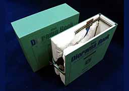 |
 | ||
HOW MUCH DETAIL IS ENOUGH?
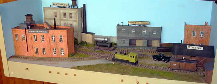
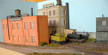
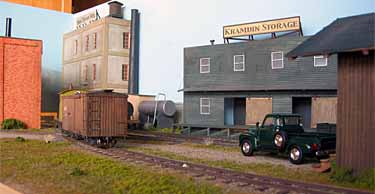
For several years we’ve been following Swiss modeler Daniel Schläfli’s development of his On30 (O16.5) 47th Street Yard (see Scrapbooks #22, #25, #35 and #42a). The question is: at what stage does a layout actually begin to look like a miniature world? In other words, how much detail is enough? One answer is found at the point where you are willing to take the layout to an exhibition and show it off to your fellow modelers and the public at large!
Daniel faced that opportunity when he agreed to show 47th Street Yard recently at the “13th Convention of American
Railroad Fans in Switzerland.” In Daniel’s words, “This event provided some stimulus and some stress for some progress, although I did not manage to do any significant detailing.” In my opinion, he did enough to give this 48x20in (120x50cm) layout a “finished” look–though there’s clearly plenty of room for additional details. This is just about the stage I like to bring my layouts up to, so I can relax and spend lots of time adding delightful details!
One of the touches I like is Daniel’s use of puns (in English!) as the names of his modelled companies: Kramdin Storage, for example. Ben Tryon Mfg. is actually a double pun … it’s named for Daniel’s employer, Maillefer, which translates from the French into something like “Bent Iron.” Nice! I always find clever names inspiring, and they goad me into making up some good ones for my own model industries!
A GOOD IDEA ALWAYS KEEPS GIVING…
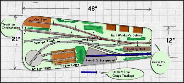
 One mark of a good layout design is its ability to continue to inspire fresh ideas for adaptation, expansion and improvement. In Scrapbook #53a, Brian Wilson, from Sidney, British Columbia, Canada, unveiled his adaptation of E.L. Moore‘s Shortline Terminal to a very small trapezoidal shelf in On30–even squeezing in a piece of a traction line!
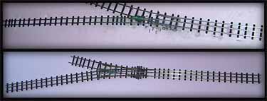
Well, Brian has added another “wrinkle”– a bit of dual-gauge shunting in a spur leading to a new industry called Arendt’s Scrapyard. Notice that there are two ways he can engineer this spur, shown in blue on the plan above. He can make it just On18 (O scale on 9mm gauge) or make it dual gauged, depending on how he constructs the turnout. So he built both versions to see which one he preferred! (The photos above show the two alternative pieces of trackage.) Guess which one he selected!? Check out his website!
Now this amazing small layout has inspired yet another idea! Notice how close together the new spur and the back of the engine house are sited. It wouldn’t take much construction to dual-gauge the nearer track in the enginehouse and bring it out through an opening in the shed’s rear wall, connecting with the spur from the scrapyard. Hm. And that development leads to thoughts about perhaps a dual-gauge turntable (with four rails, not three, for balance)!
And so it goes. Well designed layouts continually inspire ideas for changing and improving them. In fact, that’s one of the tests I use to decide on the merits of a new design.
UNUSUAL SMALL LAYOUT — BOTH ENDS ARE VISIBLE!
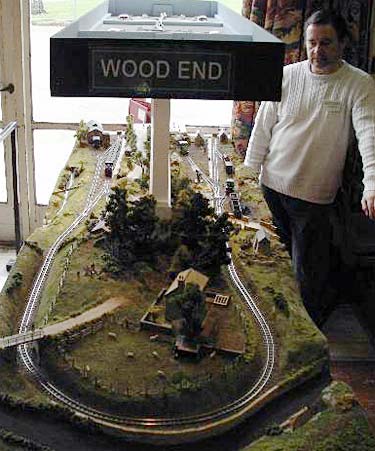
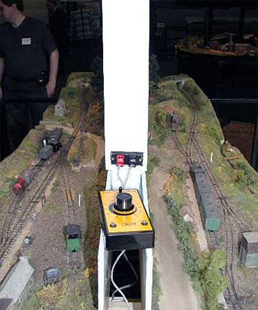
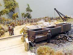
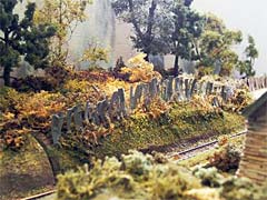
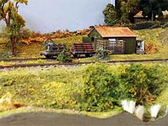
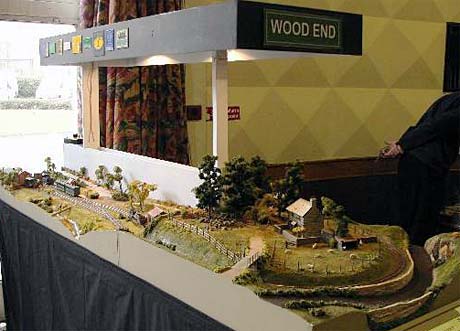 One layout design that inspires me (and several of my correspondents) models both ends of a shortline rather than building one station and running to a hidden fiddle yard. So a complete light railway can be displayed!In England, a OO9 (HOn30) exhibition layout called Wood End connects two fully-modeled termini and provides two narrow gauge layouts back to back, joined at the end. Wood End is now owned by Stephen Penn, who lives in North Yorkshire. One layout design that inspires me (and several of my correspondents) models both ends of a shortline rather than building one station and running to a hidden fiddle yard. So a complete light railway can be displayed!In England, a OO9 (HOn30) exhibition layout called Wood End connects two fully-modeled termini and provides two narrow gauge layouts back to back, joined at the end. Wood End is now owned by Stephen Penn, who lives in North Yorkshire.Emrys Hopkins took these photos at a recent exhibition. |
  |
   |
FIND AN UNUSUAL HOME FOR YOUR LINE
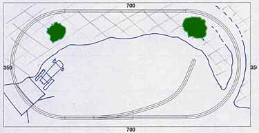
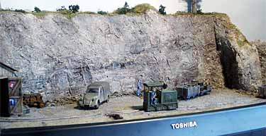
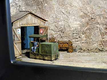
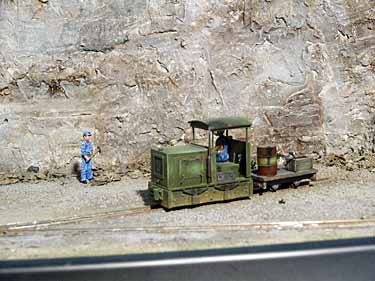
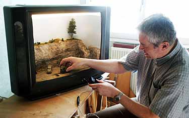 Two sources of inspiration are illustrated here by France’s Bernard Fabron. One is the use of unusual containers to house a model railway– Bernard has adapted an old television set to house an On18 (O9) layout. Seems like a good use for the cabinet after the picture tube burns out–and with the increasing popularity of flat screen TVs, there may be a lot of these around soon, so take note! (For other containerized layout ideas, see Scrapbooks #34 and #38.) Often, finding an exotic container can inspire a new layout idea!The other wellspring of creative inspiration illustrated here is the art of leaving the scene gracefully, which I call “Exit, Laughing.” There are lots of alternatives to diving into a tunnel or ducking under a bridge. Here, Bernard has used the doors of an engine house as an unobtrusive exit (lower left photo). There are literally dozens of alternative ways to leave the stage — I would like to hear from anyone who has devised an unusual exit method and has photographs to prove it! Two sources of inspiration are illustrated here by France’s Bernard Fabron. One is the use of unusual containers to house a model railway– Bernard has adapted an old television set to house an On18 (O9) layout. Seems like a good use for the cabinet after the picture tube burns out–and with the increasing popularity of flat screen TVs, there may be a lot of these around soon, so take note! (For other containerized layout ideas, see Scrapbooks #34 and #38.) Often, finding an exotic container can inspire a new layout idea!The other wellspring of creative inspiration illustrated here is the art of leaving the scene gracefully, which I call “Exit, Laughing.” There are lots of alternatives to diving into a tunnel or ducking under a bridge. Here, Bernard has used the doors of an engine house as an unobtrusive exit (lower left photo). There are literally dozens of alternative ways to leave the stage — I would like to hear from anyone who has devised an unusual exit method and has photographs to prove it! |
  |
  |
GRATEFULLY GRAB A GOOD GADGET
For better or worse, a good gadget (also called a gizmo or a gimmick) can inspire the design of an entire layout! A good example is Gilbert Gribi’s micro layout, Draversaz, in Scrapbook #45a. It is literally designed around an elevator (lift) that raises narrow-gauge trains to new levels. It was during an e-mail conversation about this layout that Shortliner Jack Trollope from the Scottish Highlands threw a claymore into the discussion. He sent photographs (reproduced here) of a prototype elevator that he had constructed. Though this version is just a foot long (30cm), it certainly could be longer to hold more rolling stock. I offer Jack’s inventive work here to offer inspiration for anyone who’d like to build a layout with space-saving vertical transportation. Please send information and photographs if you do!
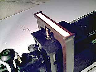 |  | 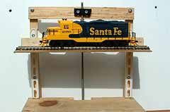 |
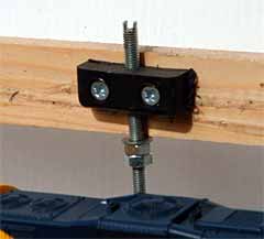 | The top three photos show how a reversible drill is used to turn a threaded shaft that raises or lowers the elevator.Details of the design are illustrated in the two lower photos. Finding a way to stop the elevator at the proper levels is left as an exercise for the modeler. | 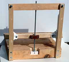 |
STAGECRAFT SETS OFF A SMALL LAYOUT
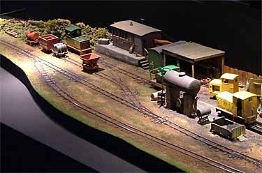
Photo courtesy Narrow Gauge Model Railway Exhibition | Another activity that always inspires me is using stagecraft ideas and methods to help our trains perfect the illusion that they are doing actual railroadlike work (see my article, “Theatrical Layout Design,” elsewhere in this site). A wonderful use of stage magic in model railroading is found in Totternhoe Mineral Railway, a long, irregularly-shaped O9/On18 layout by Eamon Seddon, now from Tasmania.The main “stage trick” here is the use of a “limbo set” — entirely flat black surroundings that leave the layout seeming to float in space, displayed like a diamond on black velvet. This creative idea is well illustrated in David Bromage’s photos (below). See Scrapbook #43a for more. |
 | Lower two photos by David Bromage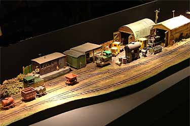 |
ARTISTRY IN BALANCING MASSES AND SIGHT LINES
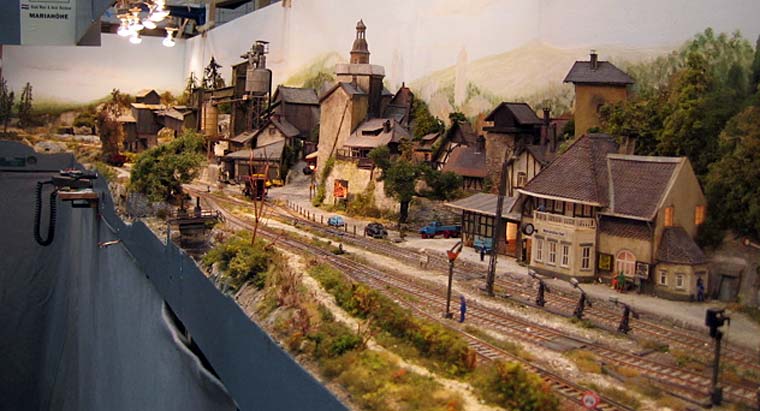
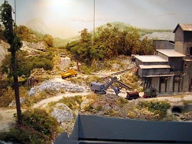
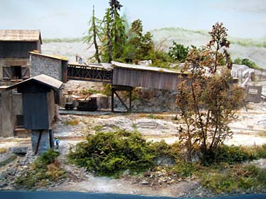
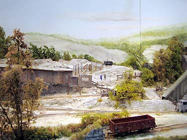
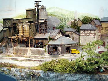
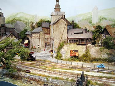
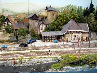
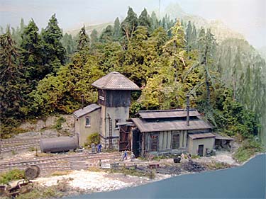
Illustrating several of the inspiration sources mentioned earlier is Mariahöhe built by two Dutch modelers, Henk Wust and Derk Huisman. In just 12 feet, they have managed to showcase all the rail transportation activities of a section of Germany in the 1960s. At the left, Henk’s module presents a quarry, rock crusher and cement factory (more large, inspiring industrial structures!) served by an HOe (HOn30) railway. Derk’s HO module on the right shows part of the town and the station at Mariahöhe East, where the finished products are shipped on normal (standard) gauge and the rail system connects with the DB (German national railway), represented by the fiddle yard offstage to the right. Track in front of the cement factory is dual gauge as shown on the plan (below).
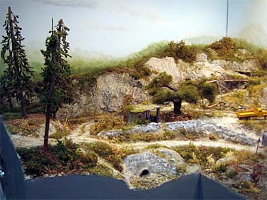
There’s a lot of inspiration here. The scenery is designed and built with a painter’s eye for composition, color and texture. In the Layout Tour photos below, notice how many of them look like paintings rather than model shots. Studying the carefully composed scenes and sight lines gives me a lot of ideas for scenery! Similarly, the layout’s purpose–the focus of all this construction–is made very clear: the line handles goods traffic between different companies and the related passenger flow to and from the town of Mariahöhe.
Another important element is the use of various levels, often only slightly different, for both track and buildings. This technique lends much visual interest to the layout and highlights the activities of the trains, especially in the narrow-gauge workings at the left end.
And a final element concerns the level of detail here. The layout appears to be highly detailed, and yet it actually is not. These modelers have a knack for including just the most important and telling details, which convinces our eyes that we are viewing a very realistic scene. Leaving out details can be a key factor to focus our attention on what is most important in the scene. (Compare George Sellios’s similar comments in the December 2006 Model Railroader magazine — he’s “reducing visual overload” by removing details from his fabled Franklin & South Manchester RR!)
And so I’ll leave you to tour this excellent and inspiring layout. Many thanks to Rail Magazine, in the Netherlands, for providing both information and permission to reproduce the track plan from the October 2006 issue. And a special thanks to Bart Bakker, from Utrecht, Netherlands, for sharing the wonderful photos he shot recently at Mariahöhe’s first exhibition.

 |  |
| 1 | 2 |
 |  |
| 3 | 4 |
 |  |
| 5 | 6 |
 |  |
| 7 | 8 |
Leave a Reply