PAGE 46 – FEBRUARY 2006

This month we present a clutch of layouts less than a foot wide,
but very, very long. They’re ideal for hallways, long walls
where floor space isn’t available for layouts, or even for
long stretches that might be found in the basement.
One of the main attractions of a long, narrow layout is the opportunity to actually make a journey on the layout. The feeling of travelling from Here to There is illustrated nicely by this HOn30/HOe layout built by Martin Hogg from Mansfield, England. Martin has used ready-to-run German HOe rolling stock running on Peco OO9 trackage to move people and goods from one end of the shelf to the other.
The line started as a shelf on Martin’s landing, and it’s modular — the first three 60x20cm (24x8in) sections are shown above. By putting in view blocks, such as the elevated roadway overbridge, Martin can divide the long shelf into separate sections. The effect is to give the spectator the feeling of moving on from place to place along the shelf. Martin plans to add more modules to the middle, which will make the journey even longer and more adventurous.
The photos below show the two terminal stations, Edibeckersee (left) and Friedrichsdorf.
PROTOYPICAL PASSENGER MANEUVERS IN SMALL SPACES
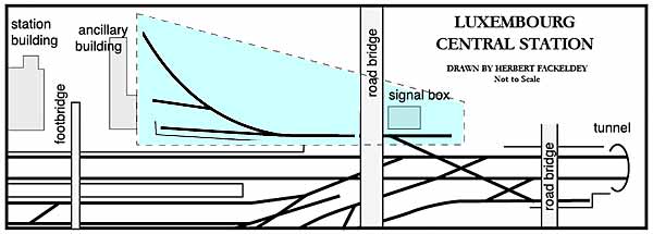

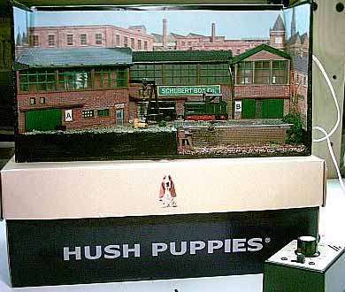
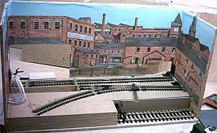
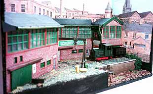
This long, narrow layout is designed for switching passenger stock, a very realistic activity at a large station such as Luxembourg. Herbert continued: “European passenger stock prior to the UIC types was generally between 21 and 23 metres long, or 24-26cm (9.4-10.2in) in H0 scale. So a classic Inglenook would need one track of about 130 cm and an headshunt one metre long. With #6 points, this amounts to 260 cms.“The headshunt (lead track) could be hidden behind a bookshelf or a cabinet, making use of a space that otherwise would be wasted. The signal box hides the hole in the backdrop, while the small building at the right hides the end of the platform track and provides a motivation for the other tracks being shorter (3 coaches). Of course, both buildings and the platform existed on the prototype.
“Speaking of the backdrop, on this side of Luxembourg station, there is just an insignificant faubourg, but one may still paint the
old walled town of Luxembourg instead, towering above the Alzette valley.”So there you have it — a prototypical Inglenook track pattern in a busy cosmopolitan terminal which allows you to use stock not only from the Luxemburg state railway (CFL), but also from all three neighbouring state railways (Belgium, France, Germany), plus Dutch, Swiss and Italian stock and CIWL sleepers and dining cars. What a bonanza!
FRENCH BRANCH LINE REVISITED
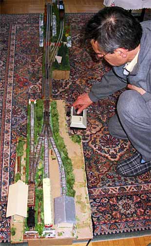
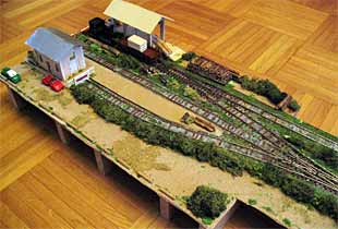
Stephane Truc, from Lyon, France, has made a lot of progress on his long, narrow line since we first visited in the March 2005 Scrapbook. The layout represents the terminus of an imaginary branch line in the Jura mountains (near the Swiss border), an area Stephane likes to visit. The terminus measures 85×25 cm (33×10 in).
When there’s room (for example, at times like those shown at right, when the floor can be used to set up the complete line), Stephane adds a 150cm (59in) extension (at the top of the photo), which represents one of the Jura mountains and conceals a fiddle yard to manipulate trains. Stephane is now working on another extension, which will lengthen the branch and add flexibility to the fiddle yard.
When this larger space is not available, Stephane runs the terminal section (bottom of picture) by itself on the dining room table or atop a bedroom bookcase, using a three-track traverser that acts as a fiddle yard and represents the “rest of the world.”
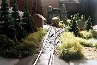
The photos below show some of the new scenery that has been put into place since last March. In particular, the eye-level shot of Stephane’s railcar approachiing the small halt (or “call”) is an excellent example of the spacious feeling that long, narrow layouts can provide. The car appears to be far in the distance and approaches our point of view slowly. The impression that a spectator gets is much like standing beside a real railroad — which is, after all, a long, narrow proposition in itself!
A CLASSIC BILL SCHOPP DESIGN FOR HO
For quite a few years, from the 1940s into the 1960s, Bill Schopp conducted a monthly layout design column for the U.S. Railroad Model Craftsman magazine, under the pen name “The Layout Doctor.” Bill designed a great many delightful small layouts, one of which has always stuck in my mind. I’ve paraphrased the original design in the drawing below, which shows a 120x8in (300x20cm) shelf layout connecting the communities Schoppstown and Laketon. I offer it as a tribute to Bill Schopp, and a good example of a successful long, narrow layout design.

The little line is set about 1900, in the border country between Pennsylvania and Maryland. Schoppstown is the setting for interchange with the Baltimore & Ohio Railroad; the Schoppstown & Southern distributes and collects cars from local industries, and conveys the freight and some passengers down to the ferry terminal at Laketon. “The Pass.” a narrow passage blasted through the shoulder of an intervening mountain, separates the two communities and promotes the feeling of making a journey along the line.
The line’s main “gimmick” occurs at Laketon, which has no runaround. All trains, however, arrive with the loco on the front end of the train, and the line uses a clever and entirely prototypical device to handle the maneuvers at Laketon. The foot or so of railway ahead of the three-way switch is a sharp downhill grade. When the loco enters this grade, it stops and detaches the cars (wagons or coaches) behind it. A small retractable pin engages the axle of the front car and prevents the stock from rolling away. The loco pulls forward by itself into the center track at Laketon.
Then comes the fun part! The pin is retracted, and the stock rolls downhill, through the switch, into one of the sidings! The loco then backs out onto the line and proceeds with its switching chores. This same procedure is performed with both freight and passengers, just as reputedly happened on a number of U.S. short lines at the turn of the Twentieth Century. A little experimenting with grades and trucks (bogies) will be required, but the fun of running a railroad using gravity switching should make the effort well worth your while! Thanks to Bill Schopp for introducing me to this grand idea.
MEET ‘JOURNEY N’ — AN EXTREME LAYOUT!
Jonathan Scott, an imaginative Australian currently living in Santa Rosa, California, has carried the long, narrow idea to extremes. Take a look at the “Journey N” railroad, being displayed here by young Edwin Scott, whom we met in the December Scrapbook.
Here’s the layout ready to travel. The two halves fold together to create the case that encloses the layout. Notice on the sides the way various parts of the two halves are cut to interlock, with walls that can provide a backdrop for the trains when the layout is unfolded and set up (below).
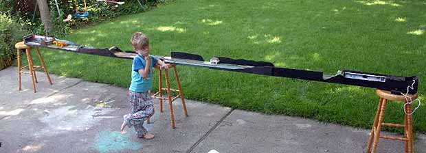
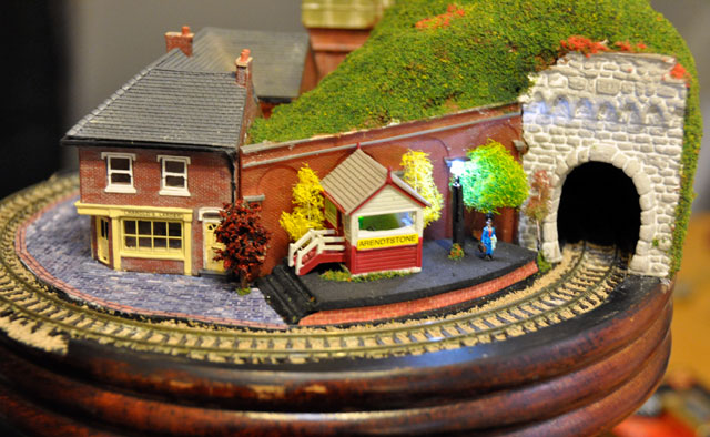
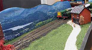
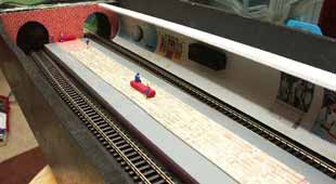
The opened layout measures 17ftx6in (5.2mx15cm)! This is a line that definitely provides the sensation of making a long journey by train — especially when you’re Edwin’s size! The packed-up size is 8ftx6x6in (2.4mx15x15cm). The layout is divided into sections or “areas” by means of a series of view blocks such as short tunnels, bridges, cuttings, and the like. The design trick is to create areas so that nothing will interfere with its counterpart in the other half when the layout is folded up.Below are photos of just a few of the many sections encountered on a journey from one end of the line to the other — including a visit to an Underground (subway) station! Scenery is generally modelled after scenes encountered in Europe, especially Germany, on vacation trips. You can see many more scenes at Jonathan’s website.


Just noticed on Scrapbook p46 that the photos for my HOe ‘modular’ layout are not there – there are pictures of my shoebox instead? Not vital of course!