PAGE 40 – AUGUST 2005
UPDATES!
With over 500 layouts on this web site, it’s no suprise that
a number of our featured designs have made progress in construction
— or as in some cases, have recently changed direction entirely!
Here’s a progress update on a few previously-reported projects.
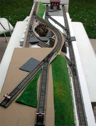
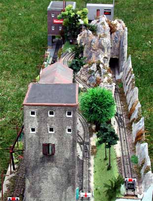
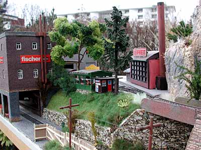
A GERMAN GUMSTUMPER GETS A FACE-LIFT!
TWO UPDATES FROM ‘SHORTLINER JACK’

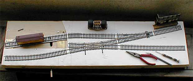
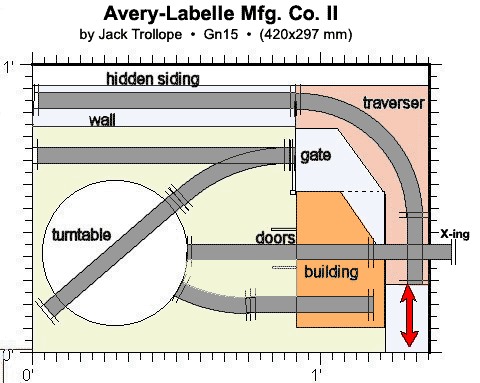 Shortliner Jack’s second update is the Avery-Labelle Mfg. Co. (Mark II). This remarkable little layout fits on an A3 sheet of paper (about 16.5×11.7 in) and provides a nearly complete range of operations in the yard outside the A-L manufacturing plant.What’s missing? Jack comments, “If I had added a cut-down Atlas 90-degree crossing, the unorthodox traverser could be used in two directions, allowing the tracks in the building to be ‘fiddled with’ as well.” And switching of cars within the building leads to such operations as “empties in-loads out” and many other variations of operating patterns. A simple addition that adds considerably to the layout’s potential!Progress here means an amazing increase in flexibility by adding just one little piece of track!
GIANT TRAINS FROM CANADA RUN WILD!
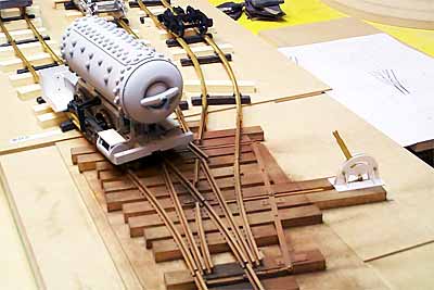 When we first visited Michael Mott from Alberta, Canada, last December, he was in the middle of building several layouts, all of which have changed direction since then!
First, Michael’s 1:10 scale layout where 30mm equals one foot, has been changed drastically. “I have revised the plan to create a 30mm scale Inglenook within a space of 70 by 19 inches,” reports Michael.
“It all hinges around a three-way frogless stub switch that works beautifully. I am really pleased with the way it operates.” (This photo shows the three-way stub switch, a mechanical marvel built to the gauge of 3.5 inches.) The loco is Michael’s work in progress, a compressed air loco that was used in Alberta and is preserved in Banff National Park. And all this is under six feet long!!
But there’s more.
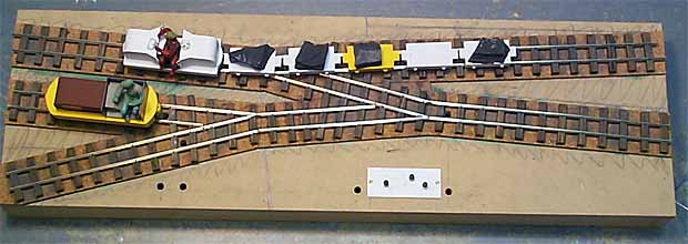
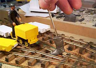 Michael is also building several Gn15 layouts — G-scale trains running on HO gauge tracks (representing 15″ gauge industrial railways). Shown here is his Kick Switch Layout, which not only has no curved track at all, but uses authentic mining turnouts with single points that are kicked to one side or the other to facilitate switching!The staged photo at the right illustrates how the kick switch works. The locos are various mining lokeys that Michael is building for this 29×9 in layout! See more at his web site.
2 LAYOUTS, EACH ON 2 SHEETS OF LETTER PAPER
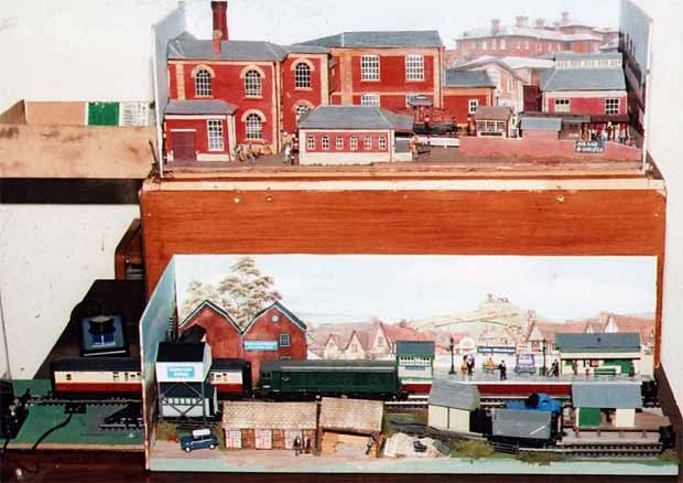
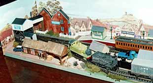
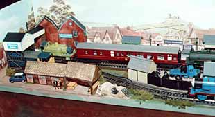
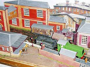 Ian Bareham, from Ipswich, England, has added more details to his well-traveled St. Augustine’s Hospital Railway (at the top in above photo and closeup at left). More unusually, he has built a second layout to the same size (594×210 mm – 23.4×8.25 in) and identical trackplan (foreground above)! Both layouts are the size of two sheets of letter paper laid end to end. The new layout is called Little Wickham, and Ian displays it in tandem with St. Augustine’s.Ian reports, “I designed it to use as many off-the-shelf items as possible, making it easy for a beginner to build a similar layout. In addition, I tried to use as many different materials and brands as possible, some plastic building kits, some cast in a single colour and others in a few colours, a cast plaster building and even card buildings.”Little Wickham is a small seaside town in East Anglia. I plan to run mainly late British Railways black steam engines & early green diesel in late 50’s early 60’s [shown in top photo]. But the other photos show possible different eras: Light Railway [left below] or even a modern preserved line (tourist railway), including the children’s favourite, Thomas the Tank Engine. [right below].”
A SECRETIVE CHANGE OF DIRECTION IN NORWAY

The link for Jon Songøygard’s web site no longer works.
Thank you, the link is removed!