PAGE 100 – August 2010
H O T I D E A S F O R S M A L L R A I L R O A D S
In This Issue
Memorable Lines
Draversaz
Dawson Station
Brooklyn: 3 AM
Working Wonders
The Stamping Ground
Les Cimes
Ginglenook Jr.
Pizzas With Pizzaz
SpiritiNg Away
Calling Card Layout
Pirates Cove
Scenic Delights
Bay Freight Division
Potter & Klayman
Homage to Escher
*** CLASSIC SMALL LAYOUTS ***
NOTE: There will be NO mid-month Scrapbook for August 2010. Next issue will appear on 1 September.
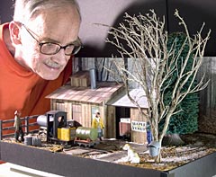
Carl Arendt and one of his micro layouts
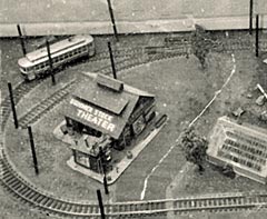
Carl’s very first micro layout, 1962
By Carl Arendt, Webmaster
While preparing issue #100 of the Small Layout Scrapbook, I’ve been glancing, with understandable pride, at the first 100 months’ editions of this e-publication — 151 pages in all. Despite my familiarity, I’m still amazed by the creativity, excitement and sheer fun shown by railroad modelers from around the world. What an adventure it has been!
I built my first micro layout (under 4 sq ft or 3600 sq cm) in 1962 (above right). This photo also appeared in issue #1 of this e-zine, dated May 2002. Since then we’ve published over 1200 different small layouts (up to 4x6ft or 120x180cm in size). And they keep pouring in by e-mail, each one with some inspiring idea or interesting feature to enjoy.
In the archives I’ve noticed a few layouts that have something special… a quality that keeps them in memory. These are the layouts that I’ve termed “remarkable,” and this page lists some that are particularly memorable to me. I’ve limited my choices to three examples in each of four categories—Memorable Lines, Working Wonders, Pizzas with Pizzaz, and Scenic Delights—plus a re-evaluation of “Classic Small Layouts,” a new look at Scrapbook #4. If I’ve left out your favorite layout, I apologize… your evaluations may well differ from mine (and feel free to let me know about it). So here they are… one man’s view of the kinds of efforts that make minimum space models special—as reported in the Small Layout Scrapbook during our first 100 months.
Some model railroad lines are memorable because they have an enjoyable “gimmick”—a single feature that sticks in the mind. For example, my SAP Line micro layout (shown in the photo above left) models a Pennsylvania maple syrup “sugar house,” wreathed in steam from a hidden smoke machine. And the steam exudes the mouth-watering smell of maple sugar, a crowd-pleaser every time. That Arendt Aromarama feature is definitely memorable!
On the other hand, a handful of layouts are memorable for being outstanding in every area… scenery, engineering, even railroadlike operations (technically called “playing with trains”). Here are three lines I would consider Remarkable Railroads because they are memorable for excellence in all areas of layout design, construction and operation.

DRAVERSAZ
By Gilbert Gribi
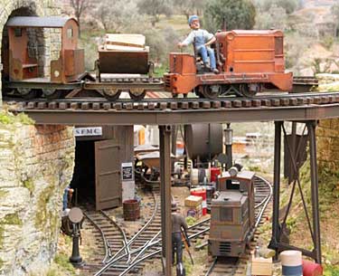
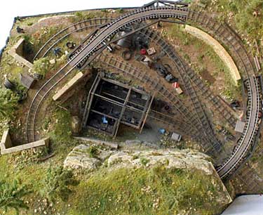
Draversaz is the first (and perhaps the only) micro layout constructed by Gilbert Gribi, who lives near Lausanne, Switzerland and is well-known in Europe for his structure and landscape modeling. Into this O scale (1:43.5), two-foot/600mm gauge (14mm) layout, he packed not only a scrupulously detailed mining scene, but also a complex three-level design held together by a cleverly engineered train elevator (lift). All this, and good operation, make Draversaz a Remarkable layout. For more, see Scrapbook #45a.

DAWSON STATION
By Ken Olsen
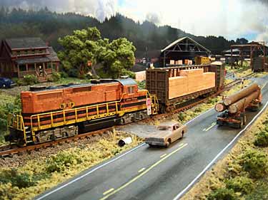
First Ken Olsen, from Adair Village, Oregon USA, made a video documentary of the last days of rail service at the Hull-Oakes steam-driven sawmill in Oregon’s beautiful Willamette Valley. You can see the videos starting at Scrapbook #88. Then Ken built a 1x4ft (30x120cm) N-scale layout duplicating the mill’s switching trackage. You can see the results on video at #92. Ken’s layout accurately captures not only the prototype operation, but also the dramatic scenery around it. All this in four square feet! Remarkable!
BROOKLYN: 3 AM
By Prof Klyzlr
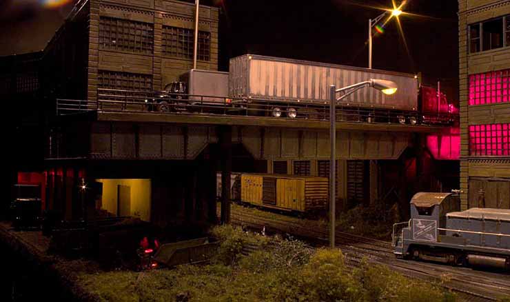
Prof Klyzlr, a pseudonymous modeler from Sydney, Australia, set out to test the limits of current modeling technology and practice. In the process of building Brooklyn: 3 AM, he produced a minimum-space masterpiece. The accomplishments of this 2x4ft (60x120cm) layout are numerous, including: modeling the “wet look” of the city waterfront after a midnight thundershower; using only modeled light sources for illumination of this middle-of-the-night scene; basing the scenery on an almost foot-by-foot reproduction of the actual scene in Brooklyn; reproducing prototype operations by using the Phantom Layout approach to include offstage operations as reflected in fiddle yards, plus designing a special traverser scheme to enhance the realism of this approach; developing a unique layout presentation, where the viewers are encouraged to place their heads actually in the layout to experience it close up and let the ambient sound system draw them fully into the highly-detailed scene; and many, many more. You can begin experiencing this remarkable model layout at Scrapbook #87.

Then there are the lines that do amazing things before your very eyes… because their creators have built them to perform feats of ferroequinology for the amazement of crowds across the world. These are the layouts that provide astounding animations that surprise and delight visitors of all ages. These are also lines that can perform amazing operations and train manipulations due to ingenious track planning and concealment. And still others explore new ways to involve the viewer with the operations of the layout. Here are a few of my favorite examples of these Wonder Workers—remarkable layouts for sure!
THE STAMPING GROUND
By Glen Anthony
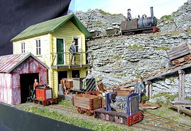
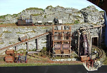
Glen Anthony, from Christchurch, New Zealand, set out to make an animated layout with lots of moving parts. He succeeded remarkably well! The Stamping Ground includes a variety of loading and unloading devices (all controlled manually), as well as an animated water wheel, a delightful animated stamping mill and more. It’s 500x1200mm (20x48in) in Gn15 scale, and you can watch it in action at left (click the lower-left triangle). There’s more info at Scrapbook #83. Since these photos were taken Glen has added two more modules to the exhibition layout for even more action.

LES CIMES
By François Meunier
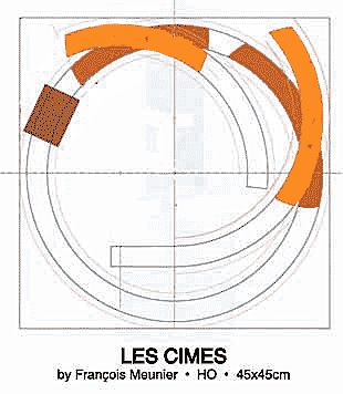
At first glance, Les Cimes appears to be an attractive, simple pizza layout. But François Meunier, from Fosseuse, in suburban Paris, France, has built in some surprises… as the track plan shows, there are two rotating sector plates concealed under the hills and giving access to two storage spurs, one of them visible. Both passenger and freight operations are thus possible on the little layout. Much kudos to François for finding a way to make a commonplace circle of track into a memorable small layout! See Scrapbook #49 for more.

GINGLENOOK JR.
By Carl Arendt
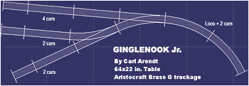
It started with my attempt to shrink an Inglenook switching layout to minimum size but still retain a satisfying shunting problem. The result is a smaller Inglenook layout using a 4-2-2 car-capacity spur arrangement (such as Ginglenook Jr. above). Object of the game is to assemble a four-car train in a pre-set configuration, from the six cars available. A 3-2-2 configuration also works, but is less challenging. See Scrapbook #69 for more. This idea proved amazingly popular, as it encouraged Inglenook-type designs in very small spaces. My original plan was for a portable G-scale layout, and Gavin Sowry (above right) operates one at exhibitions around Wellington, New Zealand. He reports that although the smaller layout is less complex than the full-sized version, it’s definitely a tough problem—about two-thirds of the people who try their luck fail to solve the Ginglenook Jr. challenge within a ten-minute period. Remarkable! (For more information on Inglenooks, see Adrian Wymann’s site, Shunting Puzzles.)

The world’s most popular small layout is the humble pizza. A simple circle of track, the layout looks like it could be stored in a square pizza box. The attraction is, of course, the scenery. Every pizza is a personal work of art for its maker… and some pizzas reach well beyond their stations in life to become remarkable and memorable. (Yes, Les Cimes (shown above) is a pizza that has been boosted by clever trackwork. But usually it’s the scenery.) Here are three examples of pizzas that transcend the ordinary to become remarkable.
SPIRITING AWAY
By Jonathan Scott
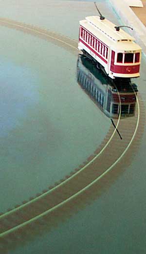
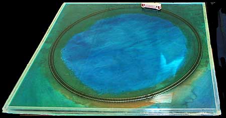
This water-filled pizza was inspired by an enchanting scene in Miyazaki’s Oscar-winning anime film, “Spirited Away,” where the heroine travels in a train that runs on tracks recently submerged by the rains. Jonathan Scott, from Hamilton, New Zealand, commemorated the scene by building an N-scale trolley that runs in water over its hubcaps. See Scrapbook #60a for more about this remarkable layout.

CALLING CARD LAYOUT
By Hiromi Masaki
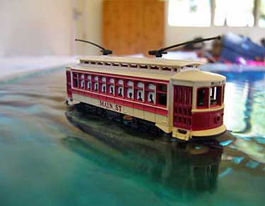
This well-traveled little Nn2 pizza was built by Hiromi Masaki, from Yokohama, Japan. Gauge is 3.75mm, and the base is the size of a Japanese calling card—90x55mm (3.5×2.2in). It has visited narrow-gauge conventions in the U.S., England, and France. Click on the triangle in the lower left corner of the photo (right) to see it in action! VERY remarkable! From Scrapbook #43.
PIRATES COVE
By Chris Walas
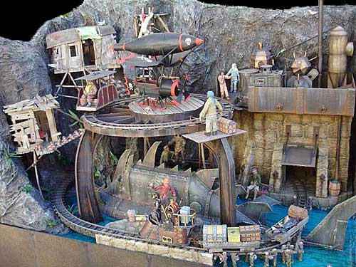
A tribute to Steampunk, this Gn15 pizza was built by Chris Walas, from Santa Barbara, California USA, to win a competition for layouts made entirely of paper. It uses many forms of paper, from sheets and rolls to papier-mâché. There are more photos in Scrapbook #72a, and a primer about “Paper Scenery” in #86. There’s a thread about building this remarkable layout on the Gnatterbox.
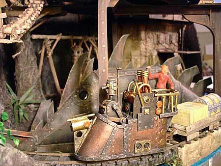
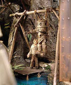

Many model layouts these days have excellent scenery. Pizza layouts (as above) are particularly attractive for their urban or rural scenery. But there’s another set of layouts whose scenery is virtually a work of art… these layouts reach new heights of scenic expression and become remarkable as a result. (Sometimes the trains are nearly irrelevant, but that’s a discussion topic for a different page.) Here then are three layouts that are a delight to the eye, and—oh, yes—they have railroads in them too!
BAY FREIGHT DIVISION
By Greg Malinowski
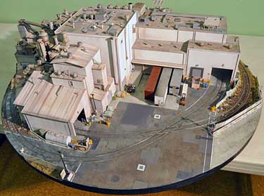
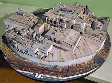
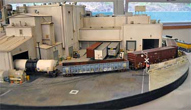
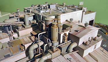
Proving that present-day modelers are still capable of producing remarkable and memorable layouts, here’s Bay Freight Division, a 36in (90cm) HO circle that is appearing for the first time in these pages. Greg Malinowski premiered it just a few weeks ago at the 2010 Bay Area Prototype Modelers Meet in San Francisco, USA. It was greeted by an uproar of snaps, crackles and clicks from digital cameras, and an avalanche of praise and comment on the internet. And as you can see, it richly deserves all of that attention!
Just for the record, the layout is an inverted figure eight, with the inner loop getting down to about a 12-inch radius, hidden inside the brilliantly caricatured factory structure. The train is just slightly shorter than the circumference of the inner loop, so that as the locomotive appears from the doorway at the left of the loading area, it hits the crossing just in time to miss the caboose, which is about to enter the right-hand doorway. You can see all this eye candy and heart-pounding action at this You Tube video. (These still photos are all by Harry Wong, kindly forwarded to me by Gordon Werner.)
POTTER & KLAYMAN
By Ian Campbell
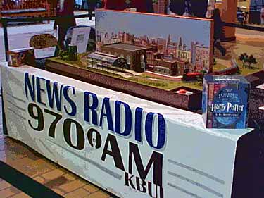
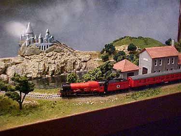
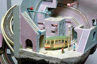
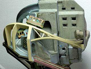
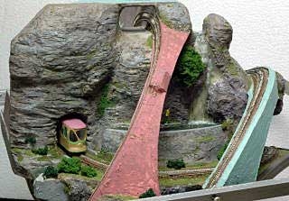
Not surprisingly, landscape artists tend to use urban scenery for their small-layout projects. After all, a city scene packs more details into a given space because it’s highly compressed in reality (urban real estate is expensive!). In any event, here’s another sculptural work of art that was designed as an urban industrial scene (a pottery factory) in Gn15 scale (1:24 on 16.5mm gauge). Ian Campbell, from Ontario, Canada, designed Potter & Klayman as a piece of sculpture with a railroad in it. In fact, there’s some evidence that a train has never been run on these tracks!
The layout has been exhibited a number of times by Ian’s friend, Brian Fayle, as an interesting layout that we all can learn from. The photos above give you some idea of the over-all shape of the layout (left) and the kinds of mini-scenes produced by treating the whole as a 3-D artwork (right). For more of Brian’s photos of this remarkable layout, see Scrapbook #79.
HOMAGE TO ESCHER
By Koike Noriyuki (nickname “Rehsi”)
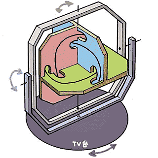
Rehsi’s layout is designed to be viewed as a work of art, inspired by the topsy-turvy world of M. C. Escher’s print, “Relativity.” Mounted in a TV gimbel, the layout can be turned in any direction for viewing. There are photos from several angles in Scrapbook #67a.
The design issues and engineering challenges of planning and building this layout give me a headache! They’re explained, along with the ways that Rehsi solved them, at his website. His methods for keeping the little trolleys on the track—and maintaining electrical contact—are fascinating in themselves. But I find it very satisfying just to look at this delightful creation. I think Rehsi’s wonderful and surprisingly scenic little layout pretty well defines the word, “”remarkable.”
CLASSIC SMALL LAYOUTS V E R S I O N 2.0
In 2002 some members of the Small Layout Design Discussion Group on Yahoo nominated their choices for Classic Small Layouts, the most admired designs. The resulting consensus list was posted on the Group site and published here as Scrapbook #4. The Classic Layouts were chosen because they had been selected by a great many model railroaders as inspirations for their own layouts. That is, they all have been “widely imitated.”
From the perspective of 2010, some 96 months later, it’s clear that a couple of the selections were not as popular as they seemed then, and other, newer designs are now inspiring even more new layouts. So it’s time for a re-examination of the Classics list. Here is Version 2.0 — Classic Small Layouts as viewed in 2010. There are several new additions! All layouts are drawn at approximately the same scale so you can see their relative sizes. They’re presented here in chronological order. It’s a remarkable collection!
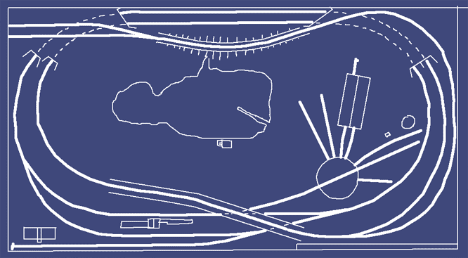
ORIGINAL GORRE & DAPHETID RR
By John Allen, c. 1950
HO, 43x80in / 109x203cmJohn Allen was one of the best known U.S. model railroaders, primarily on account of his superb scenery and photography. His very first G&D layout was a bombshell when it appeared in print at mid-Twentieth Century. It had everything: marvelous landscape, detailed structures, and a track plan that encouraged operation in a very small space. To this day, it’s still a leader in the “most-often-imitated” category of small layouts. Some things do change, though—when it first appeared, G&D I was regarded as extraordinarily tiny; today, it’s the largest layout in the collection!

MINORIES
By Cyril J. Freezer, 1957
OO/HO, 10x72in / 25x180cmBesides serving 50 years as editor of two leading model railway magazines in Britain, CJF was also a prolific track planner, publishing over a dozen books of plans. By far his most popular design was Minories, a small-space passenger terminal with a particularly pleasing and easy-to-build arrangement of turnouts at its entrance. Literally hundreds of modelers have built versions of Minories over the years, especially after its 50th birthday celebration in 2007. For more information, see our Tribute to CJF and David Thomas’s historic view in Scrapbook 61a.

SWITCHMAN’S NIGHTMARE
By Linn Westcott, c. 1958
HO, 16x72in / 40x180cmLong-time editor of Model Railroader magazine, Linn Westcott also designed a wide variety of track plans including Switchman’s Nightmare, which appears in his book, 101 Track Plans for Model Railroaders. Though not the first of its kind, the Nightmare is the best-known example of a “stack of track” layout plan. Perhaps because of its inclusion in a book that has remained in print for over 50 years, this layout and its brethren have inspired an impressive number of busy model lines that emphasize railroad operations.
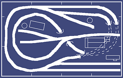
CROOKED CREEK RAILWAY
By Roy Dohn, c. 1958
HO, 30x48in / 75x120cm
Dr. Roy Dohn’s tiny three-level layout used short 0-4-0 locomotives, stub switches, and four-wheeled rolling stock to pack an amazing amount of activity into a small space. Many modelers followed his example, and the trend is continuing—as recently as August 2009, Railroad Model Craftsman magazine published a nice On30 layout inspired by the Crooked Creek. Another recent example is at Scrapbook #97, and there are undoubtedly more on the way.

GUM STUMP & SNOWSHOE RR
By Chuck Yungkurth, c. 1960
HO, 12x72in / 30x180cmI receive more e-mail about Chuck Yungkurth’s Gum Stump & Snowshoe than about any other layout design. It remains, after 50 years, one of the most popular track plans around. Yes, it has obvious flaws—Chuck wrote me last year, “Operation was always frustrating because there was no runaround track, and the requirement for two locos was always a bit nonsensical.” Nonetheless, the combination of levels and switchbacks remains irresistible to modelers. (Most people put in a runaround and use just one loco.) We’ve devoted a full page to Gumstumping, and there are many other examples in these pages and at train shows around the world.

PIANO LINE
By Rev. P. H. Heath, 1965
OO, 12x60in / 30x150cmAmong the army of British clergymen devoted to model railroading was Rev. P. H. Heath, whose pioneering layout, Piano Line, “adopted the ingenious idea of bringing the main line in centre stage (upstage centre if you want to be theatrical about it) within the run round loop.” Saves space, improves operations. The quotation is from David Thomas in Scrapbook #61a. Rev. Heath’s ingenious “wrinkle” has been attracting followers ever since he first published it, 45 years ago.

TIMESAVER
By John Allen, 1966
HO, 10x56in / 25x142cm
The only man to design two Classic Small Layouts is John Allen (the other is his Original Gorre & Daphetid above). The G&D is a traditional “slice of life” layout, but the Timesaver was designed to be a switching (shunting) puzzle. For rules of the game, see Adrian Wymann’s excellent Shunting Puzzles site. This particular configuration of runaround loop plus spur plus kickback siding is also a typical American station layout, and so the Timesaver has also been used as a station on a great many larger U.S. layouts. There are lots of small layouts based on it as well… see the Micro Layout Design Gallery, for example.

INGLENOOK SIDINGS
By Alan Wright, 1978
OO, 10x48in / 25x120cm
The second major model railway shunting puzzle layout was created in just the opposite way from the Timesaver. Alan Wright built a normal slice-of-life layout that happened to have a couple sidings along one straight passage. And somehow, over time, that two-turnout, three-sidings arrangement evolved into the Inglenook Sidings… a subtle and complex switching challenge. For the history and rules, see Adrian Wymann’s Shunting Puzzles page. For a few examples of the many, many layouts built on this pattern see the Micro Layout Design Gallery and Scrapbook #69.

BOX STREET YARD
By Jack Trollope, 1998
HO, 8x66in / 20x168cmThe newest addition to the Classic Layouts collection is Box Street Yard, by Jack Trollope, who lives in the Scottish Highlands. Jack has concocted a delightful switching district using just two turnouts (one of them a double-slip). This arrangement has proved very popular for home layouts as well as exhibition use by modelers who love shunting challenges. The layout’s beginnings are chronicled in the Micro Layout Design Gallery, and a variety of examples are on display in the second half of Scrapbook #65a and also scattered through the Scrapbooks’ first 100 months. Use the Google Search box on the home page to find other Box Street varietals.
Sirs, I’ an 87 year old.I bought “Track Design” new in 1960 where in is Dr. Roy Dohn’s “Crooked Creek Railroad” spread. Over the years I’ve built it twice HO & N gauge.
In looking thru your page 100 I saw your reference to C.C.R. found the page 97 and sent off to “Railroad Model Craftsman” for the August 2009 issue where they published a nice On30 layout inspired by the C.C.R. I’m deep into On30 so I couldn’t wait for it to arrive. Finally it came BUT, nothing in that issue about any On30 layout let alone the Roy Dohn C.C.R. inspired On30 version. Did I get something wrong? I would really appreciate any help on finding that article. I may have enough left in me to build a 3rd version in On30.
Thank You
Jack R. Lewis
Enjoyed site would like to know more