Theatrical layout design
Stage tricks for small layouts, usable on any size pike
by Carl Arendt
[This article was originally published in Layout Design Journal magazine (LDJ-35) and is presented by permission in abbreviated form here.]
“The layout is our stage,” Frank Ellison wrote in the 1940s, “and the trains are our actors.” Frank’s Delta Lines pioneered in taking a theatrical approach to modeling real railroad activities. As an old trouper himself, Frank appreciated the value of stage tricks in creating the impression that our models are genuine, hard-working transportation systems.
In the fast-growing part of this hobby dedicated to minimum space railroading, the need for theatrical devices is compelling. A small-layout designer uses creative tricks of all sorts to cram a lot of operations into an incredibly tiny space. Many of the best design tricks are borrowed from the theater. Here are some examples that may give you ideas for your own railroad.
THE BASIC “PICTURE FRAME”
For many, the most familiar part of a theatrical production is the proscenium arch, the “picture frame” that surrounds the stage. The proscenium showcases the production’s set and, most important, controls the audience’s sight lines. People watching the performance see only what we want them to see. This kind of visual control can help model layouts do a better job of emulating a real railroad doing real work.
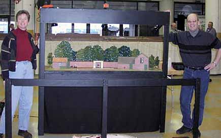 A typical open Picture Frame layout is Whinny Lane, a Gn15 shelf line by Ian Holmes, from Princeton, Minnesota. Ian is a transplanted Englishman who designed his layout for English-style exhibition. The picture frame is high and wide, with lots of open space. It’s not intended to limit vision so much as to focus attention on the railroad as distinct from the train-show distractions around it. The top crossbar holds a lighting rig, which creates a bright pool of light in contrast with the normal room lighting, also setting the layout apart.
The line is exhibited at adult waist height, allowing children to see it roughly at eye level. It was designed for display at the Great American Train Show, so caters to family viewing. The tall proscenium arch makes it easy for adults to see what’s going on while standing in front of the layout. The lighting focuses their attention on the railroad’s operations.
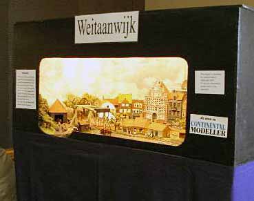 At the other end of the spectrum, Weitaanwijk by Englishman Tony Bennett is enclosed in a “presentation box” that totally controls the audience’s view. It’s exhibited at adult eye level. Tony built it this way because it features day and night lighting effects, and he wanted to eliminate interference from ambient light.
The layout is HO narrow gauge, built in a 3×3 foot space. It represents a late 19th Century rail line in the Netherlands — you can see a canal at the front left. Although some switching is featured, the main attraction of this layout is a parade of Dutch trains running through some admirable scenery, fed by the hidden “fiddle yard” backstage.
Lighting is dramatic and stagy. The curved backdrop arc is another stage technique, called a cyclorama. It not only complements the 3-D scenery, but it effectively hides the backstage skulduggery that keeps the layout active. Backdrops work hard for a living in small layouts, and backstage manipulations to meet operational needs are virtually a design necessity. All these theatrical standbys will show up in various ways in the layouts we’re examining.
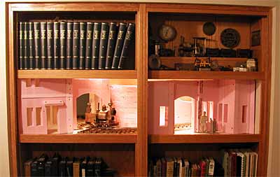 A good illustration of the way a picture frame can direct the audience’s point of view is Marty Johnston’s Von Leipnik’s Interplanetary Transportation Co. This layout is built to a scale of 7/8-inch to the foot (1:13.7 proportion). It runs on G-gauge trackage, representing a two-foot narrow gauge line. These are very BIG trains, even though they’re models of small narrow-gauge prototypes. In this giant scale, Marty’s around-the-walls pike becomes technically a “small layout!”
Centerpiece of the layout is a bookcase, in which two side-by-side scenes are set off by their surrounding frames. Lighting is carefully controlled, and the layout continues beyond the two scenes.
The most intriguing part is that one scene shows a view of the dock and the laboratories above it, while the other scene is an interior view set inside the machine shop, allowing the audience to view the passing trains through the windows! Although the two frames are side by side, and the layout behind them is continuous, the two scenes appear completely separate. Our eye easily accepts the picture frame limits, and the results are very effective.
WHAT’S A SHADOWBOX?
I’ve recently seen articles in the U.S. model railroad press referring to layouts behind frames as “shadowboxes.” This term is actually incorrect for this context. A “shadowbox” is a very shallow box with a transparent cover and usually a frame. It’s used to display small three-dimensional items such as coins, jewelry, or military medals — items just big enough to cast a shadow. Very few model railroads are that shallow, so I use the more accurate term, “Picture Frame Layouts,” instead.
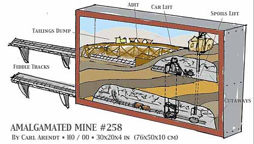 Having said that, I’d like to show you a model railway design that actually is a shadowbox! Amalgamated Mine #258 was designed to fit in a very shallow box and hang on a wall, displayed like a painting. When I originally designed it, I presented it as the “world’s first flat-screen model train layout!”
The layout is only 4 inches deep, and the frame measures 30×20 inches in HO scale. The design represents a cutaway view of a mine — it could be digging out coal, ore, gold, silver, pitchblende, or whatever. Two internal elevators bring up the mined material as well as the excavated tailings.
The usable raw material comes to the ground-level where it’s loaded into ore cars, hoppers, or gondolas and hauled away to the processing plant (represented by the offstage fiddle track that’s mounted on the wall beside the shadowbox). A little train (perhaps narrow gauge) on the upper level collects the tailings and carries them across a trestle to be dumped on the spoils piles.
Individual lighting will likely be required at each level, recessed into the body of the layout and behind the crossbar at the top. Since 2003, when I introduced this design, several of these true shadowbox layouts have been built in scales ranging from N to Gn15.
COMING IN ON A WING
Most Picture Frame layouts are deeper and have more complex track plans. And they permit us to use some more stagecraft tricks to improve operating and scenic possibilities.
A traditional part of any proscenium stage is the wings — the areas at the sides, out of view of the audience. Actors make their entrances and exits past curtains or flats, called “tormentors,” that screen the wings from the audience. Model railroad designers sometimes call them View Blocks, and they’re especially useful (and easy to do) in Picture Frame layouts.
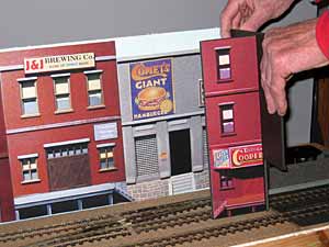 One example is my On30 Peek’s Pike, where a flat tormentor actually extends out into the stage area and conceals a two-track exit hole from the audience. In addition, it’s decorated as a cooperage industry with a loading dock painted on it to provide an extra spot for switching (the cooperage produces barrels for this brewery layout).
All kinds of stunts have been devised to block the audience’s view at strategic locations — from 3-D structures to trees, road overpasses, and low hills. These days there’s something of a competition to dream up new and different ways of concealing exits to the fiddle yard.
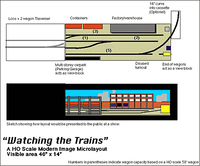 A good example is Ian Holmes’s design for a modern-image switching layout, Watching the Trains, based on an industrial district in St. Paul. Ian conceals the fiddle-yard entrance behind a concrete-slab parking garage that allows the audience to catch tantalizing glimpses of the trains as they proceed to the hidden fiddle yard exit. The garage actually exists on the prototype.
At the other side of the layout, he mounts half of a boxcar, as if it’s parked on a track just beyond the frame. Actually, with the Picture Frame layout presented at eye level, the boxcar blocks the audience’s view of the switching crew’s exit, supposedly to other shunting responsibilities. They’ll return the same way in reverse.
WORKING IN THE ZONE
Another theatrical technique that works well with Picture Frame layouts is the idea of “zones.” A zone is a defined area of the stage, usually distinguished by special scenery and lighting. Separate activities can take place in different zones, sometimes even simultaneously.
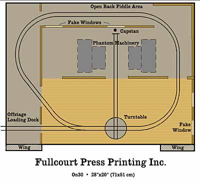 Fullcourt Press Printing Inc. clearly illustrates the idea of zones. The setting is a printing plant, where a small industrial tram is used to bring in heavy rolls of paper to the presses and to haul away the end product, cartons of printed materials. Dick Andrews described a prototype line very much like this one in the NG&SL Gazette for Sept/Oct 1981.
The setting features a brightly lit shipping room zone in the foreground, with a dimly illuminated press room zone just visible at the back. Flat cars of paper rolls are brought in from the wings (also dimly lit), and placed on the turntable to be hauled by rope and capstan back into the darkened press room. The presses are only suggested as vague shadowy shapes at the back, where the operator’s Giant Hand can be used to load and unload cars without being seen in the gloom.
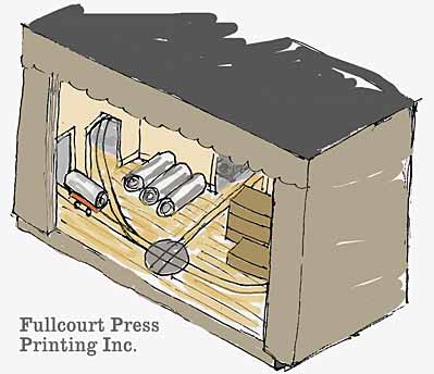 Turntables, by the way, have been an important part of stage machinery for several centuries, being used well before railroads were invented. They deserve an article to themselves as a theatrical device that can greatly enlarge operating possibilities, especially in small layouts. Besides turning locomotives they can rotate rolling stock ranging from single four-wheel cars to entire passenger trains.
The Fullcourt Press design also provides a chance to use another theatrical device — sound effects. A woofer speaker located beneath the layout can reproduce the rumble of the presses strongly enough to make the audience actually vibrate. What realism!
In contrast, the bright and dim zones are reversed in my Bilevel Shoebox design, a Gn15 layout that fits in a shoebox. “Shoebox layouts” have become something of a trend since I first suggested them in 2003, and there have even been modeling competitions for these tiny pikes in several countries. Hundreds of them have been built, and many use these theatrical tricks to make a strong impression in a minimum space.
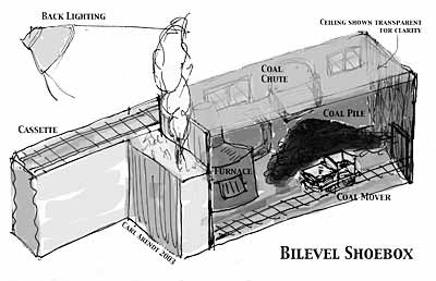 In the dimly lit foreground of this design is the basement of an institution, like a school or hospital. A coal pile is at the right, and a small tramway hauls the coal over to the furnace at the left. The design is based on a basement tram in a real high school in Yonkers, New York, during the 1940s.
Outside, behind the furnace room and up at ground level above the basement, is a brightly lit narrow gauge line that delivers coal to the school, dumping it into the basement through the coal chute. The narrow gauge train arrives from a detachable cassette, and we can see the equipment only through the basement windows and the coal chute (when it’s opened).
The dramatic contrast between light and dark zones, coupled with the operations of two very different rail carriers in this tiny space, makes for a dramatic presentation of this little shoebox layout. Operations are simple, but visually very entertaining.
The concept of zones can readily be transferred to larger layouts. They can considerably expand the operating potential of virtually any plan.
AN ULTIMATE THEATRICAL EXPERIENCE
Finally, there’s an exciting type of stagecraft known as “flying the set.” To change a stage setting very quickly, you can simply attach ropes and pulleys and haul the set up to a hidden loft area overhead (called “the flies” in a theater). With careful design, any number of sets (or portions of sets) can be “flown” in this way.
My design for a simple shelf railroad, The Midnight Flyer, has three different sets stored away in its attic, representing three different destinations for the company’s trains — all on one knot of tracks!

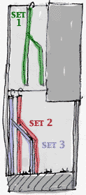
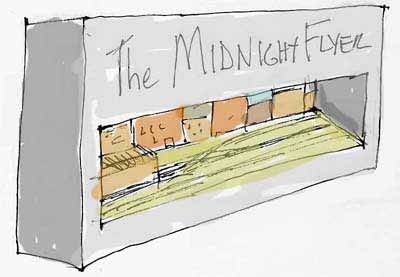
Each setting consists of a backdrop decorated to represent a specific location. The shell of a building at the left hides the fiddle track, which is open to the rear. The three settings are constructed to nestle together comfortably when they’re unhooked from the upper storage area and dropped down to the stage below. Backdrops can be modeled in very low relief or even just painted on, like the dramatic backdrop of Peek’s Pike.
As an example, an operating session might start with all three sets in the lower position. The visible setting, Set 1, might represent an urban switching district. Our road diesel hustles about, collecting cars and distributing others, and then exits to the fiddle track. The lights are dimmed (or extinguished), and Set 1 is flown to the rafters, revealing Set 2 as the lights come back up.
Set 2 might be a rural industrial park. The switcher again appears, distributes and collects cars, and again retires to the hidden fiddle track. Lights out signals the next act, and Set 2 is flown to reveal Set 3, a bustling port town complete with cranes and docks. After the loco finishes its tasks at the port it again retires to the fiddle track, and the sequence is reversed — bringing the sets back down one by one — to return to the big city via the industrial park.
The mechanism for flying the sets can be as simple or complex as you like. The easiest arrangement is simply to use swiveling hooks at each end that fit over a rod, much as hanging folders fit in a desk drawer. To manipulate a set, just lift it by the hooks, swivel them out of the way, and rehang the set from a pair of lower rods. Puppet theaters often change scenes quickly this way.
You could build as many sets as your imagination can create — all usable on exactly the same track layout. This simple theatrical trick can give you miles and miles of operating fun using just inches of track!
I don’t know whether anyone has yet built a “flying set” model railroad. If you’re the first, please send me some photos for the Web site!
And if any of these theatrical ideas gives you notions about your own layout designs, I’d love to hear from you.
—–
Carl Arendt is a long-time designer and builder of minimum space layouts. He’s the webmaster at www.carendt.us, a Web site that contains over 600 very small layout designs in all scales from designers in all parts of the world. The site was named to the “Top 10 list of model railroading Web sites” in Model Railroader magazine (April 2005). This year Carl published his third book about minimum space railroading, called “Carl Arendt’s Small Layout Scrapbook.”